.svg)
Resources:
Explore our Ad Gallery for examples of this component
In this article, you will learn:
How to Add Content to your Tabs
How to edit the Layout of your tabbed unit
How to edit the Design of your tabbed unit
How to to add the Tabs component
- Once you've created your ad, select Tabs from the Components drop down menu. The Tabs Component can be added to any type of Format.
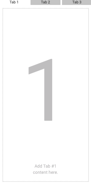
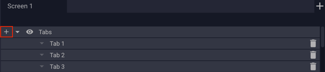
- You'll now see a tab set on your ad canvas. By default, your tab set will have three tabs. You can add additional tabs by clicking the + icon on the Tabs Component layer.
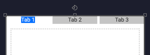
Editing Tab Labels
To edit tab labels, double click on the label text. Enter the desired tab label.
Adding Tab Content
Select the tab you'd like to add content to. Once active, you can add text, components, animations etc. like you normally would on any ad canvas. To add content to another tab, select that tab and add your content.
How to modify the Layout of your Tabs
The Tabs component Layout properties are explained below:
Click the Layout tab at the top of the Tabs properties menu.
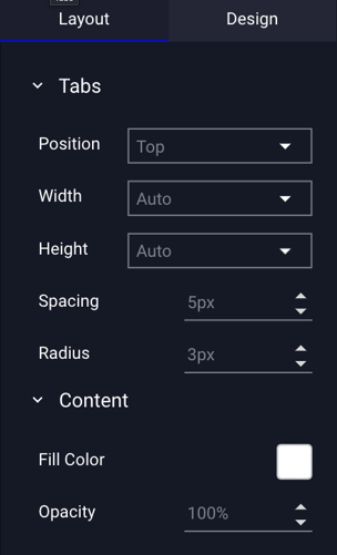
| Tabs | |
| Position | Where your tabs will be positioned. Choose from Bottom or Top placement. |
| Width |
The width of the tab. Auto: By default, your tab width is set to auto, with tab width automatically set based on the number of tabs and the overall width of your tab set. Fit To Label: Tabs will be sized to text label. Custom: Select Custom to set tab size manually (px). |
| Height |
The height of the tab. Auto: By default, your tab height is set to auto, with tab height automatically set based on the overall dimensions of your tab set. Custom: Select Custom to set tab size manually (px). |
| Spacing | The space (in pixels) between your tabs. |
| Radius | The corner radius of your tabs. |
| Content | Content refers to the area below your tabs. |
| Fill Color | Set the color of your content background. |
| Opacity | Set the opacity of your background. |
How to modify the Design of your Tabs
The Tabs component Design properties are explained below:
Click the Design tab at the top of the Tabs properties menu.
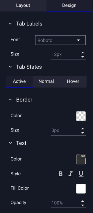
| Tab Labels | |
| Font | Set the font of your tab labels. |
| Size | Set the font size of your tab labels. |
| Tab States | Tab states allow you to set different styles for active, normal and hover states. |
| Active | Tab that is currently selected. |
| Active - Border | Sets the color and size of the active tab border. |
| Active - Text | Choose the color and style of the active tab label text. |
| Active - Fill | Set active tab fill color and opacity. |
| Normal | Inactive tab state. |
| Normal - Border | Sets the color and size of the normal tab border. |
| Normal - Text | Choose the color and style of the normal tab label text. |
| Normal - Fill | Set normal tab fill color and opacity. |
| Hover | Tab state on hover over. |
| Hover - Border | Sets the color and size of the hover tab border. |
| Hover - Text | Choose the color and style of the hover label text. |
| Hover - Fill | Set hover tab fill color and opacity. |