.svg)
Resources:
Explore our Ad Gallery for examples of this format
In this article, you will learn:
How to Configure the Eclipse Unit Properties
For access to this format within Adventive, please contact customer support
How to Build an Eclipse Unit
Below you will find a step-by-step process to build an Eclipse unit.
- Provide a unique Name for the unit, and select Eclipse from the Format dropdown.
- Define your Leave Behind screen dimensions. Displaying this Leave Behind screen in the ad is optional, but dimensions will need to be input within this intro screen in order to create the ad.
* Note - Initial video wall / image wall dimensions are always 100% x 100% -
Backup Image (Optional) and Click URL (Optional) may be left blank at this time, click Submit.

Configuring the canvas
The builder will now load the main Eclipse canvas (referred to as Screen 1), and represents the "expanded" or full screen video/creative wall.
Screen 2 represents the leave behind ad unit (optional header banner/wallpaper), and is defined by the dimensions entered in step #2.
Screen 1: Expanded (Video Wall / Creative Wall)
Screen 1 will only show a transparent full width background placeholder where your video will be, the video will not load in the builder, but will be accessible in the preview of the ad unit.

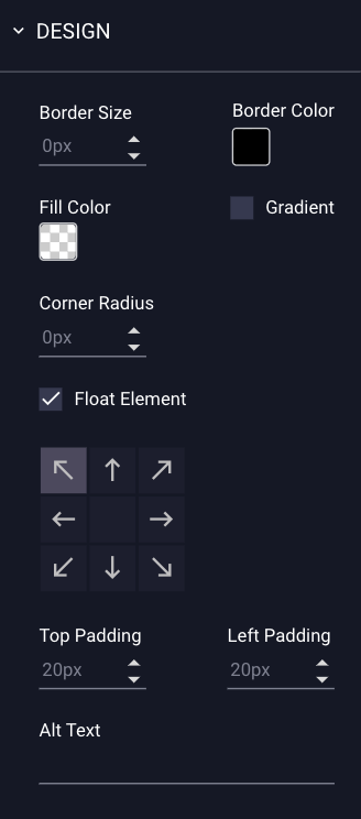
In addition to the background video, you may wish to include images "overlayed" on top of the video such as call to actions, or logos. It is important to ensure these overlays are configured to "Float" to ensure that they maintain consistent positioning regardless of the size of the users screen.
To float an asset, add it to your canvas, and then select it to reveal its properties in the right-hand menu (be sure to check the Float Element option in the Design menu). The arrows indicate which region of the screen the asset will float on, allowing it to stay in frame when the ad unit is scaled. Optionally you can increase the level of padding around the object if necessary:
Screen 2: Leave Behind (Header Banner / Wallpaper)
You may configure the Eclipse without the use of the leave behind. See below for instructions on setting the leave behind frequency, using the "Show Leave Behind" dropdown menu options.

Configuring the General Ad Properties
Modifications can easily be made to the general ad configuration using the General Ad Properties panel on the right-hand side of the builder window. See this article for instructions on configuring the General Ad Properties.
How to Configure the Eclipse Unit Properties
Screen 1: Expanded (Video Wall / Creative Wall) Specific Settings
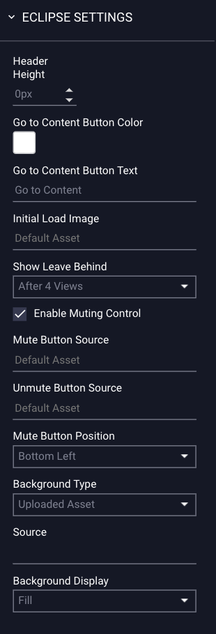
The Eclipse properties configuration options for screen 1 are explained below:
| Header Height | This setting can be used to accommodate the main sites header and is expressed in pixels. |
| Go to Content Button Color | The color of the "Go To Content" button located in the lower middle of Screen 1. |
| Go to Content Button Text | The text of the "Go To Content" button. |
| Initial Load Image | An optional placeholder image that will load prior to the video playback start (this is particularly useful for heavy or long loading video content). |
| Show Leave Behind |
Instructs Adventive to begin showing the leave behind screen 2 when the viewer has seen the main screen 1 expanded video/image X number of times. * Note - When set to "Never", the leave behind will never be shown. |
| Enable Muting Controls | Enables the mute/unmute button for the video wall. |
| Mute Button Position | Defines the location of the mute / unmute button. |
| Background Type |
Uploaded Asset - Use a video or image asset uploaded to Adventive. YouTube - Utilize a YouTube Video link. |
| Source | The source file, or YouTube URL. |
| Background Display |
Two options are available, which will determine how the video or image wall displays: Fill - Video/image will fully fill the container. Contain - Video/image will keep the exact file size. |
Screen 2: Leave Behind (Wallpaper / Banner) Specific Settings
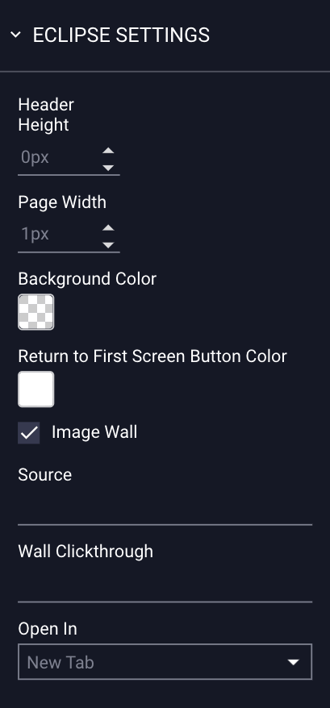
The Eclipse properties configuration options for screen 2 are explained below:
| Header Height | This setting can be used to accommodate the main sites header and is expressed in pixels. |
| Page Width | The page container width expressed in pixels. |
| Background Color | The Background Color. |
| Return to First Screen Button Color | The color of the "Return to Screen" button. |
| Image Wall | Enable an image wall (background image) to display behind the top leave behind banner. |
| Source | If "Image Wall" is selected, the "Source" field will appear, where you can upload the image wall asset. |
| Wall Clickthrough | If "Image Wall" is selected, the "Wall Clickthrough" field will appear, allowing you to enter a specific clickthrough URL for the secondary screen / image wall. |
| Open In |
By default, the click through link will open in a new tab, but you can also set it to open in the same tab. |