.svg)
In this article, you will learn:
How to Configure the General Properties of an Ad Unit
How to Change the Format of an Ad Unit
How to Configure the Background and Borders of an Ad Unit
How to Configure the Design Settings for Image Assets
How to Use the Color Picker or Set HEX or RGBA Values Directly
How to Configure the General Properties of an Ad Unit
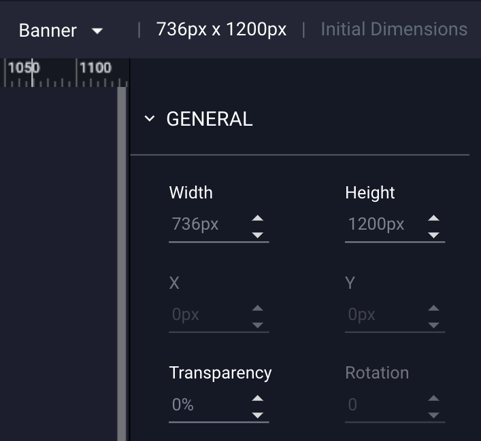
The Properties Panel is located to the far-right of the Ad Builder.
This dynamic, context sensitive panel will update to display only the relevant settings for the screen, layer or component that you have selected at any given time.
By default, if no object is selected, or if the user clicks outside of the ad unit anywhere on the stage area, the panel will display settings for ad container itself (i.e. width & height, background color, etc.)

General Properties
The General properties configuration options are explained below:
| Width | The width of the ad unit (or selected object) expressed in pixels |
| Height | The height of the ad unit (or selected object) expressed in pixels |
| X | The X-axis position of an object based on the upper-most left-hand corner of the selected object |
| Y | The Y-axis position of an object based on the upper-most left-hand corner of the selected object |
| Transparency | The level of transparency applied to the canvas mask of the ad (0% - transparent - 100% invisible) |
| Rotation | The degree of rotation of an object (0 - 360 degrees) |
| Intro Animation | Option for adding "flourish" animation to the ad unit as a whole. More information on this can be found within our knowledge base article Intro Animations. |
| Responsive Screen |
If checked, Adventive will automatically scale the selected screen based on the width of the device that the unit is viewed on. * Note - This option MUST be selected per screen in multi-screen ads. If the selected ad format is natively responsive, this option will not appear. |
| Z-Index Override | The Z-axis position of the ad unit relative to the page it is being served on. |
| Sync Ad Screens | When selected, go to screen actions will be synchronized between different ads trafficked on the same page. |
| Sticky Ad | If checked, the ad will stick to the top of the page as the user scrolls, instead of scrolling off screen. If this option is not available, the format you have chosen is not compatible with Sticky Ad functionality. |
| Duration | This setting will only display if the "Sticky Ad" option is checked. This allows you to set the duration of the sticky functionality (in seconds). |
| Padding | This setting will only display if the "Sticky Ad" option is checked. This allows you to add padding above the ad to accommodate your site's header (set in pixels). |
| Show Container | This setting will only display if the "Sticky Ad" option is checked. This inserts a wrapper around the ad, in a color/transparency of your choosing. This spans the width of the browser, and will display on user scroll. |
| Ad Name | The name of the ad unit |
| Default Click URL | The URL that anyone that clicks through will be directed to unless a specific Click URL has been configured for an object within the ad unit |
| Open In | Choose if the ad unit click through will result in the opening of a New Tab or Same Window. |
| Fallback Image | (Optional) The image (of the same initial dimensions of the ad unit) that will be displayed should the users browser not be capable of displaying the rich media unit. |
How to Change the Format of an Ad Unit
The format can be selected upon initial ad creation. However, if you selected the incorrect format, you can change it once the ad is loaded within the builder.
- Once in the builder, navigate to the upper right corner and locate where is lists the format. In the below example, "Banner" was originally selected:
- Click the dropdown menu to select a different format.
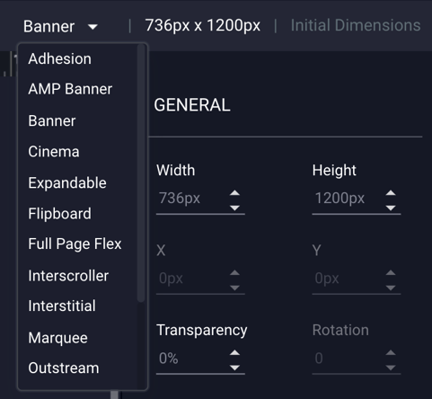
- The builder will then update to display the configuration settings for your selected format. For guidance on building specific formats, check out this article.
How to Configure the Background and Borders of an Ad Unit
- The border and background fill colors may be configured at the ad unit level. By default, all ad units are created with a white background and no border. Many of these options will apply to selected images, objects, and components on the stage, however, if no object is selected, or the user clicks outside of ad unit on the stage area, the panel will display the "Design" settings of the ad unit, as seen below:
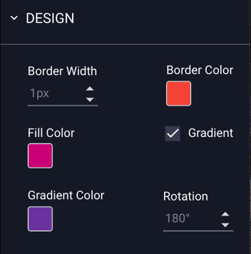
General Design Properties for Unit as a Whole
The Design properties configuration options are explained below:
| Border Width | The width of the border expressed in pixels. |
| Border Color | The color of the border. |
| Fill Color | The color of the background of the ad unit. |
| Gradient | (Deselected by default) When checked, gradient controls are enabled. |
| Gradient Color | The secondary (gradient) color of the background of the ad unit. |
| Rotation | The degree of rotation of the gradient color expressed in degrees. |
How to Configure the Design Settings for Image Assets
- As mentioned above, many of the Design Properties will apply to selected images on the stage as well. The above Design Properties are also available for selected image assets, along with additional settings.
* Note - Information on uploading assets and adding them to your canvas can be found within our article Asset Management. - When an image asset is selected, the panel will display the "Design" settings of that specific image asset:
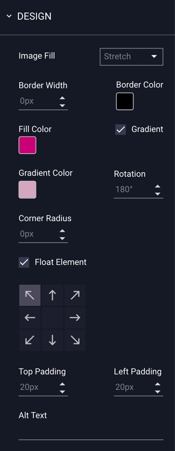
Design Properties for Image Assets
The Design properties configuration options for selected image assets are explained below:
| Image Fill |
Choose how your image asset displays within its bounding box:
|
| Border Width | The size of the border on the image asset, expressed in pixels. |
| Border Color | The color of the border on the image asset. |
| Fill Color | The color of the background of the image asset. |
| Gradient | (Deselected by default) When checked, gradient controls are enabled. |
| Gradient Color | The secondary (gradient) color of the background of the ad image asset. |
| Rotation | The degree of rotation of the gradient color expressed in degrees. |
| Corner Radius | Adjust the curve of the corners of the image asset by increasing or decreasing the corner radius. This is set to 0px by default (square corners). |
| Float Element |
(Deselected by default). Ensures that the image maintains consistent positioning regardless of the size of the users screen. Once selected, the arrows indicate which region of the screen the asset will float on, allowing it to stay in frame when the ad unit is scaled. Optionally, you can also increase the level of padding around the object if necessary. |
| Alt Text |
All images, icons, videos, and buttons that convey means, or are interactive, should have a text alternative. Implementing text alternatives allows screen readers to describe the corresponding button, icon, image or video the user may be presented with, hovering over, or otherwise interacting with.
|
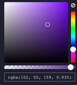
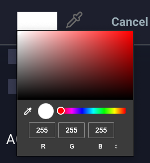
How to Use the Color Picker
When selecting a color throughout the ad builder the color picker will provide the user with common colors, previously selected colors, HEX or RGBA input, and color sliders as seen below:

Common / Previous Colors
When open, the left-hand side of the color picker will present the user with a grid of colors commonly used, as well as any previously used colors near the bottom of the grid.
To return to transparent from a selected color, select the last item in the grid, signified with a checker-like pattern. You can also set the transparency using the slider/selection bar below the color square and hue selection bar.
Eye Dropper Tool
You can use the eyedropper tool  to select a color from your canvas, or by selecting it within the color rectangle, located in the bottom center of the color picker window:
Color Selector Matrix and HEX Colors
When open, the right-hand side of the color picker will present the user with a color selector matrix and vertical scrubber bar. The user may input a HEX value in the input box below if the desired color is known.
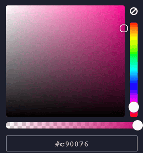
Alpha Channel
The color picker also supports the selection of an alpha channel, which can be modified using the horizontal scrubber bar. The user may input a RGBA value in the input box below if the desired color and alpha channel are known.