.svg)
Resources:
Explore our Ad Gallery for examples of this component
In this article, you will learn:
How to Add the Tooltip Component
How to Configure the Tooltip Component Properties
How to Configure the Tooltip Text Style Options
How to Add the Tooltip Component
Below you will find a step-by-step process to configure the Tooltip component:
- Once you’ve created your ad, select Tooltip from the Components
 drop down menu, located on the left side of the builder:
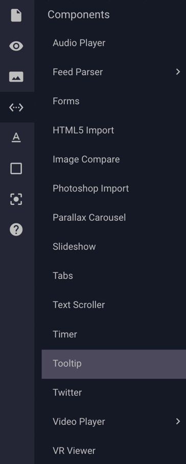
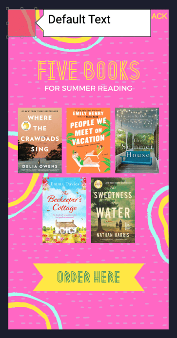
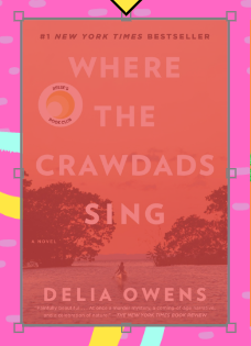
- A red box will appear in the top left corner of your ad canvas, along with a white text balloon containing "Default Text":
- Change the size of the red box and move it to cover the area of your ad that you would like the balloon to show upon action by the viewer.
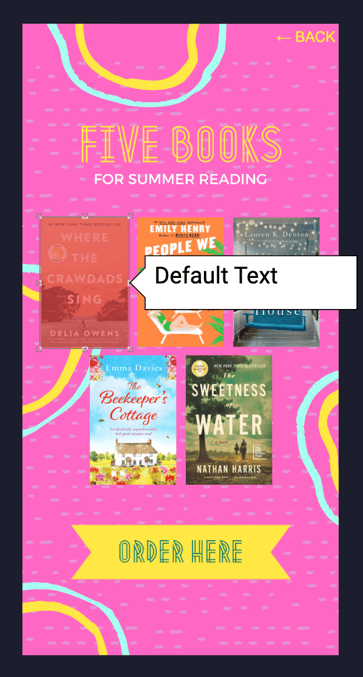
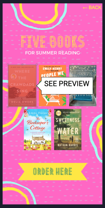
- Next, type your text within the white balloon box. You can also change the size of the balloon box.
How to Configure the Tooltip Component Properties
- To adjust the Tooltip properties and functionality, select the Tooltip component on your canvas:
- The Tooltip Component Properties panel will appear on the right side of the builder:
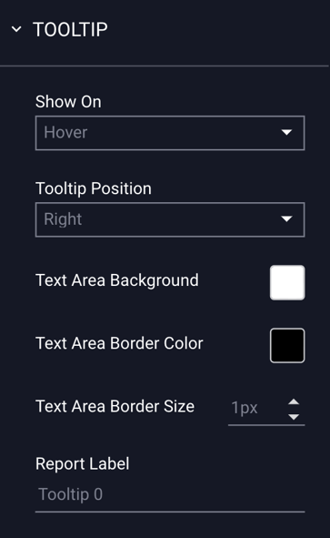
The Tooltip Configuration Options are explained below:
| Show On | |
| Hover | The Tooltip balloon will show when a user hovers over the area where the red box is placed. |
| Click | The Tooltip balloon will show when a user clicks on the area where the red box is placed. |
| Tooltip Position | Choose where you want the white balloon to display. |
| Right | Displays tooltip balloon to the right of the red box. |
| Left | Displays tooltip balloon to the left of the red box. |
| Top | Displays tooltip balloon above the red box. |
| Bottom | Displays tooltip balloon below the red box. |
| Text Area Background | You can change the color of the text background by clicking on the white box in this field and selecting a color and clicking “OK”: |
| Text Area Border Color | You can change the border color in this field. Follow the same steps as picking background color: |
| Text Area Border Size | Use the arrows in this field to change the border size. |
| Report Label | Click within the field to change the name for reporting purposes. By default, it is labeled as "Tooltip 0". |
How to Configure the Tooltip Text Style Options
- To adjust the style of the text, select the Tooltip's text balloon box:
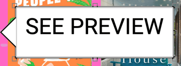
- The Tooltip Text Properties panel will appear on the right side of the builder:
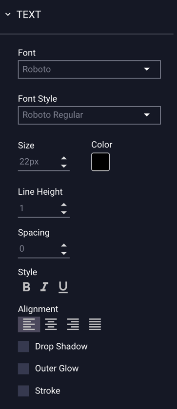
|
Font |
Choose the font to display. |
| Font Style |
Depending on the font you choose, there are certain style options available. * For example, the Roboto font comes with a variety of styles including Light, Light Italic, Regular, Regular Italic, Bold, Bold Italic, Black, and Black Italic. |
| Size | Font size. |
| Color | Font color. |
| Line Height | Adjust the height of the text line. |
| Spacing | Adjust the spacing between letters. |
| Style | Choose from bold, italic, or underlined. |
| Alignment | Choose to align your text left, right, center, or justify text (align to left and right). |
| Drop Shadow | Add a drop shadow to your text. |
| Outer Glow | Add an outer glow to your text. |
| Stroke | Add a stroke of color to your text. |
Once finished, Preview  and Save your ad.