.svg)
Resources:
Explore our Ad Gallery for examples of this component
In this article, you will learn:
How to Add the Audio Player Component
How to Configure the Audio Player Component
How to Add the Audio Player Component
- Choose the ad format and dimensions of the ad unit you wish to add the Audio Player component to. For guidance on building specific formats, check out this article.
- From the left menu, select the components icon
 , Audio Player.
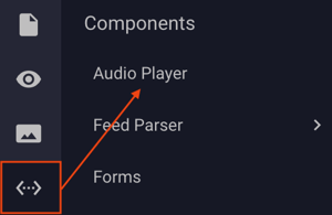
-
Once the Audio Player component is added to the canvas, you can begin configuration using the right hand component configuration menu:
How to Configure the Audio Player Component Properties
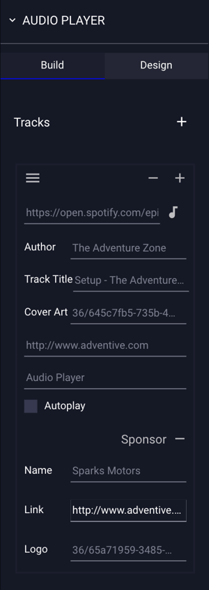
The Audio Player component Build configuration options are explained below:
| Tracks | By default, the player will display one track. You can add additional tracks by clicking the plus sign (+) located in the top right corner of the build menu. |
| Enter Track | Enter the URL of the audio file, or select an audio file from the asset manager by clicking the musical note icon. |
| Author | (Optional) Enter the Author of the audio track. |
| Track Title | (Optional) Enter the Track Title of the audio track. |
| Cover Art | (Optional) Upload the Cover Art of the audio track. |
| Click URL | Enter the Click URL of the destination, should the user click on the audio player Author, Track Title, or Cover Art. |
| Log Name | (Optional) Append a unique label for the Audio Player, which will display in campaigns and reporting. |
| Autoplay |
If selected, the track will autoplay if the browser settings allow. If an additional track is added to the component, and a user clicks the "Next" * Note - In most browsers, user interaction is required to play audio or video within an ad unit. |
| Sponsor | (Optional) You may configure the Audio Player to show Sponsor-related information including the Name, an optional Click URL and a Logo. |
 button, the second track will autoplay automatically.
How to Modify the Design of the Audio Player
- Click the Design tab at the top of the Audio Player properties menu:
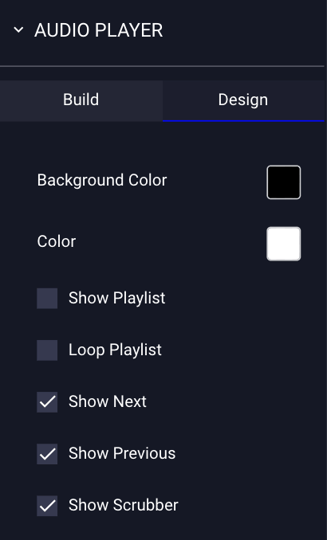
The Audio Player component Design configuration options are explained below:
| Background Color | Select the background color for the component. By default, the background color is set to black. |
| Color | Select the text and button color for the component. By default, the color is set to white. |
| Show Playlist | If selected, this will show a menu button  on the bottom of the component, allowing the user to click and view the playlist. on the bottom of the component, allowing the user to click and view the playlist. |
| Loop Playlist | If selected, the playlist will loop automatically. |
| Show Next | This is selected by default. If unselected, the "Next"  track button will disappear. track button will disappear. |
| Show Previous | This is selected by default. If unselected, the "Previous"  track button will disappear. track button will disappear. |
| Show Scrubber | This is selected by default. If unselected, the scrubber/audio timeline display will disappear. |
 your ad.