.svg)
In this article, you will learn:
How to Configure the Hitbox Properties
How to Add a Hitbox
- Once you’ve created your ad, select the Hitbox icon,
 located within the tools panel on the left side of the Builder:
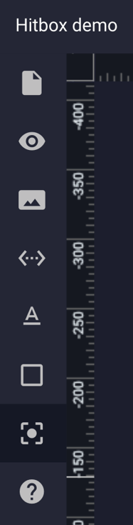
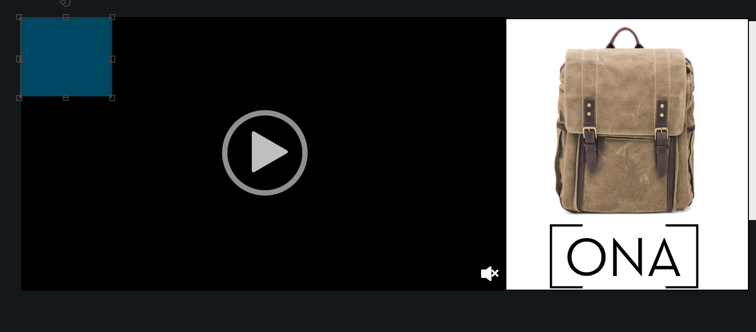
- You’ll see a blue semi-transparent box appear in the top left corner of your ad:
- You can move and resize this box, either with your mouse or by using the Width/Height in the General Properties Panel (top right of screen).
* Note - In this example we will place the Hitbox over the “Video” section of the ad: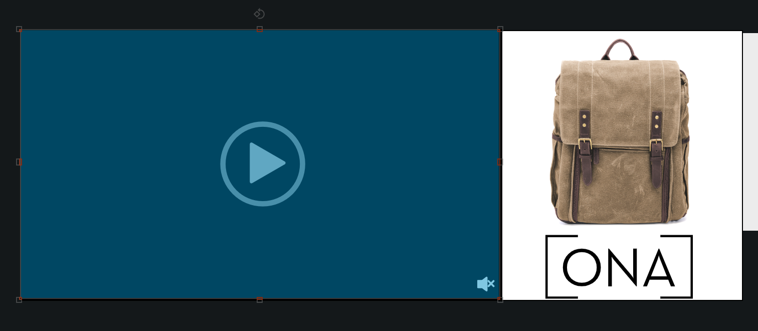
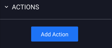
- Add an "Action" to your Hitbox by selecting the Hitbox on your canvas, and then going to the “Actions” panel, located on the right side of the Builder.
- Click the blue "Add Action" button:
How to Configure the Hitbox Properties
Once you have added your Hitbox to the canvas and clicked the "Add Action" button, you can select the type of action you'd like to be associated with it.
Actions are single-event operations to trigger something specific to happen within your ad build.
- Once you have selected your Hitbox and clicked the blue "Add Action" button, the "Actions" section will then appear in the Properties panel:
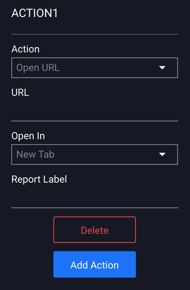
- You have the option to Open URL, Go To Screen, Open Adhesion, Open Overlay, Open as Full Page Flex, Open Sidekick, Call, Close Ad, Add To Calendar, Email, or Download File.
- Click the "Action" dropdown menu to select the type of action you'd like added to the Hitbox:
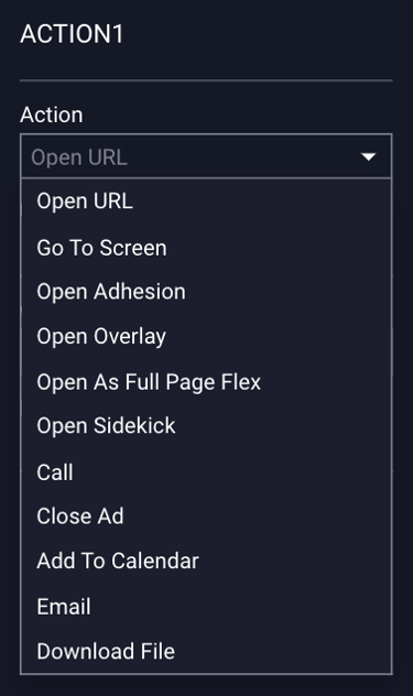
Types of Actions:
- This selection will cause the area of your Hitbox to Open a URL you specify.
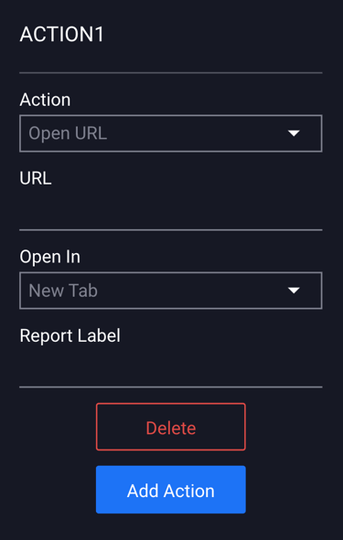
- Enter the URL that you'd like the user to be directed to, choose to open it in a New tab or the Same Tab, and add an optional Report Label.
- This selection will cause the area of your Hitbox to open up to the screen you specify.
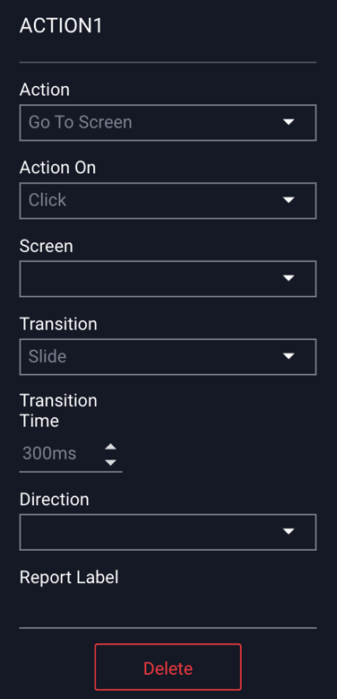
- You can apply the action to happen upon Click, Hover Over, Hover Off, Timed, In View, Mobile Swipe, Mobile Shake, or On Scroll. Select which screen from the dropdown, the type of Transition (Slide, Fade or Push), the Transition Time, Direction, and an optional Report label.
- This selection will cause the area of your Hitbox to open up another screen as an Adhesion.
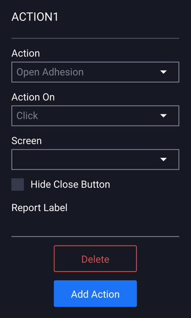
- You can apply the action to happen upon Click, Hover Over, Hover Off, Timed, In View, Mobile Swipe, Mobile Shake or On Scroll. Select which screen from the dropdown. You can choose to "Hide the Close Button", and add an optional Report Label.
- This selection will cause the area of your Hitbox to open up another screen as an Overlay.
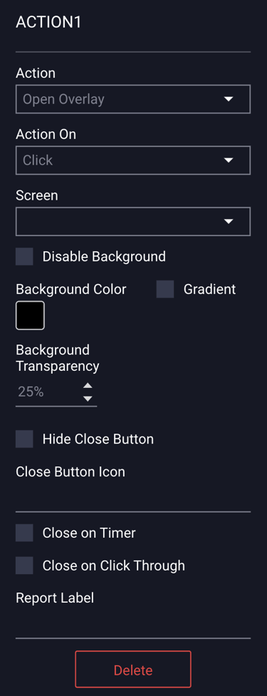
- You can apply the action to happen upon Click, Hover Over, Hover Off, Timed, In View, Mobile Swipe, or Mobile Shake. Select which screen from the dropdown. You can select or deselect the “Disable Background”. You can also choose a Background color, Gradient and set the Background Transparency. You can choose to "Hide the Close Button". The “Close Button Icon” is set as a default but you can upload your own button image from here. You can also choose to “Close on Timer” or “Close on Click Through”, and add an optional Report label.
- This selection will cause the area of your Hitbox to open up another screen as a Full Page Flex.
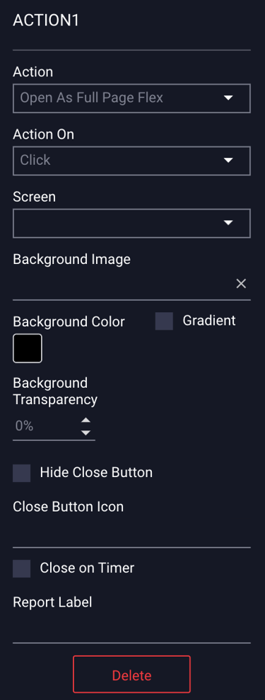
- You can apply the action to happen upon Click, Hover Over, Hover Off, Timed, In View, Mobile Swipe, or Mobile Shake. Select which screen from the dropdown. You can set a Background Image and also choose a Background color, Gradient and set the Background Transparency. You can choose to "Hide the Close Button". The Close Button Icon is set to a default - you can upload your own image. You can also select “Close on Timer”, and add an optional Report label.
- This selection will cause the area of your Hitbox to open up another screen as a Sidekick.
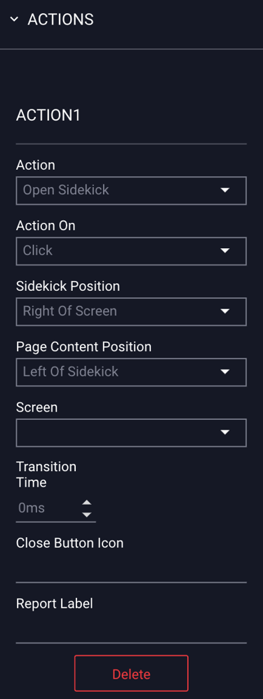
- You can apply the action to happen upon Click, Hover Over, Hover Off, Timed or In View. Select which screen from the dropdown, select the Sidekick Position, and Page Content Position. Select which screen from the dropdown and the Transition Time. The Close Button Icon is set to a default - you can upload your own image, and add an optional Report label.
- This selection will cause the area of your Hitbox to call a phone number you specify. Only “Click” can be selected for the “Action On” field.
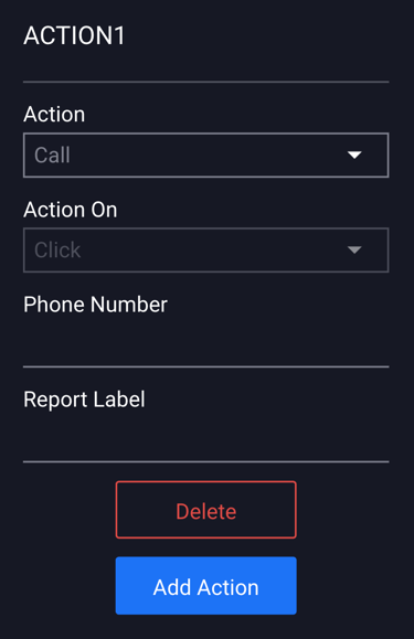
- Add the Phone Number and an optional Report label.
- This selection will cause the ad to close when a viewer selects the area with this action set to it.
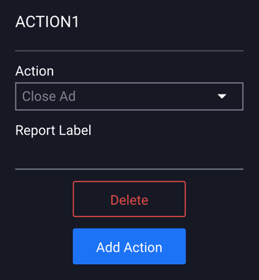
- Add an optional Report Label.
- This selection will cause the ad to add an event to the viewers calendar.
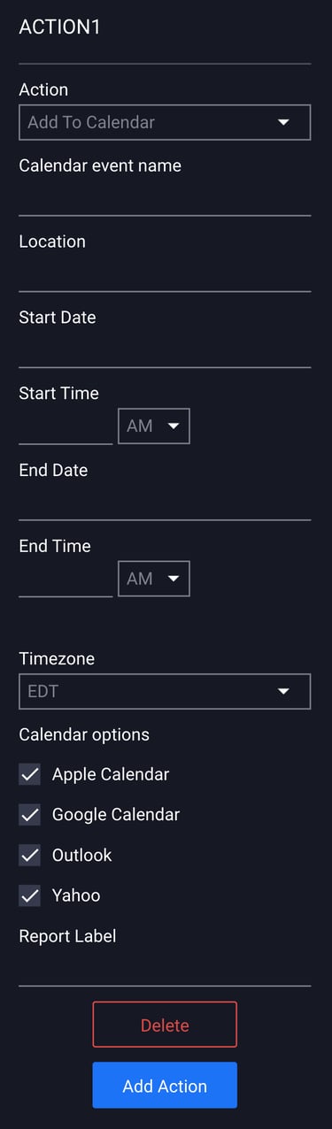
- Insert a Calendar event name, select the Start Date, Start Time, End Date, End Time, Timezone, the type of Calendar invite (all options are selected by default), and an optional Report Label.
- This selection will cause the ad to open an email prompt, easily allowing the user to connect via email. Only “Click” can be selected for the “Action On” field.
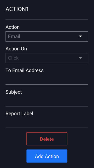
- Enter the email address of the recipient, the Subject line for the email, and add an optional Report Label.
- This selection will cause the ad to launch/download a preselected file to the viewer's computer. Only “Click” can be selected for the “Action On” field.
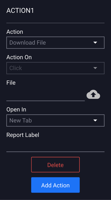
- Select the file, choose to have it open in a New Tab or the Same Tab, and add an optional Report Label.
- Adventive allows most non-executable file formats: pdf, png, gif, jpg, tiff, bmp, xlsx, csv, doc, docx, txt, mp3, mp4, webm, mov, psd, ai, eps, zip.
- The file upload max file size is 50MB.
- The File will not be saved in the Advertiser's Asset Manager. To access the file/to swap, etc., you will need to edit from the Action Menu/"File" field within the builder, by re-selecting the cloud icon.

Save and Preview to test.
Additional Notes
- To add additional actions, select the blue “Add Action” button below your previously added action:
- Action 2 will then be added to the Actions Properties panel:
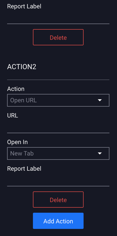
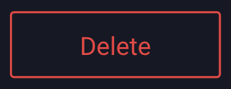
- To remove an action, select the object/layer/asset that has the action set and click the red Delete button in the Actions Properties panel below the added action.