.svg)
In this article, you will learn:
How to Configure the Design Settings for Image Assets
How to Configure the Design Settings for Image Assets
The Properties Panel is located to the far-right of the Ad Builder.
- This dynamic, context-sensitive panel will update to display only the relevant settings for the screen, layer or component that you have selected at any given time.
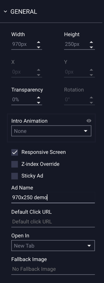
- By default, if no object is selected, or if the user clicks outside of the ad unit anywhere on the stage area, the panel will display general settings for ad container itself (i.e. width & height, background color, etc.)
- When an image asset is selected, the panel will display the "Design" settings of that specific image asset:
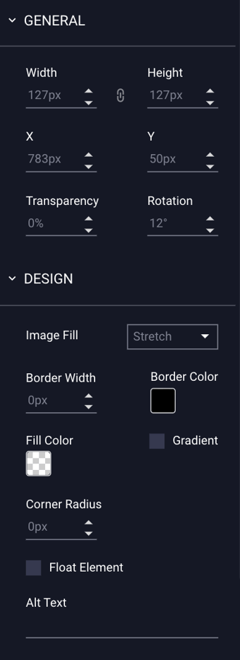
Design Properties for Image Assets
The Design properties configuration options for selected image assets are explained below:
| Width & Height |
Allows you to adjust the width and height of a selected image, object, or component on your canvas. * Note - The lock icon |
| X & Y |
Allows you to adjust the location of a selected image, object, or component on your canvas. X represents the horizontal axis location, and Y represents the vertical axis location. * Note - You can use your keyboard arrows to fine tune the coordinates/location of objects as needed. |
| Transparency |
Transparency of a selected object. |
| Rotation |
Rotation of a selected object. |
| Image Fill |
Choose how your image asset displays within its bounding box:
|
| Border Width | The size of the border on the image asset, expressed in pixels. |
| Border Color | The color of the border on the image asset. |
| Fill Color |
The color of the background of the image asset. * Note - More information on our Color Picker can be found within our article Configuring Ad Properties. |
| Gradient | (Deselected by default) When checked, gradient controls are enabled. |
| Gradient Color | The secondary (gradient) color of the background of the image asset. |
| Rotation | The degree of rotation of the gradient color expressed in degrees. |
| Corner Radius | Adjust the curve of the corners of the image asset by increasing or decreasing the corner radius. This is set to 0px by default (square corners). |
| Float Element |
(Deselected by default). Ensures that the image maintains consistent positioning regardless of the size of the users screen. Once selected, the arrows indicate which region of the screen the asset will float on, allowing it to stay in frame when the ad unit is scaled. Optionally, you can also increase the level of padding around the object if necessary. |
| Alt Text |
All images, icons, videos, and buttons that convey means, or are interactive, should have a text alternative. Implementing text alternatives allows screen readers to describe the corresponding button, icon, image or video the user may be presented with, hovering over, or otherwise interacting with.
|
 will allow you to lock the aspect ratio size of a selected object. When selected, you can scale the object proportionally, without holding the shift key.