.svg)
Resources:
Explore our Ad Gallery for examples of this component
In this article, you will learn:
How to Add the Slideshow Component
How to Configure the Slideshow Component Properties
How to Modify the Design of the Slideshow
How to Modify the Transition Settings of the Slideshow
How to Add the Slideshow Component
Below you will find a step-by-step process to configure the Slideshow component
- Choose the ad format and dimensions of the ad unit you wish to add the Image Slideshow component to. For guidance on building specific formats, check out this article.
- From the left menu, select the components icon
 , Slideshow.
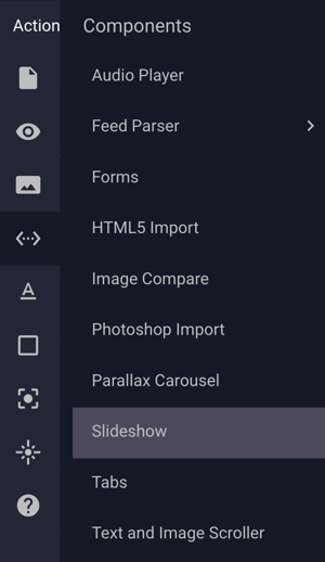
- Once the Slideshow component is added to the canvas, you can begin configuration using the right hand component configuration Build menu:
How to Configure the Slideshow Component Properties
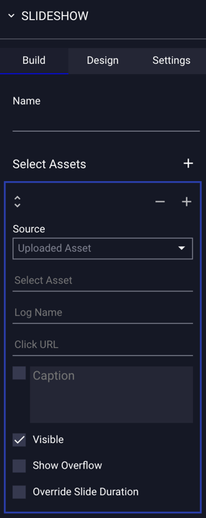
The Slideshow component Build configuration options are explained below:
The slideshow component allows for an unlimited number of slides.
To add additional slides, click the  icon, to remove, click the
  icon.
icon.
To reposition slides, click and drag the slide with the  icon.
icon.
| Name | Define a name for the slideshow. This will be used in analytics. |
| Source |
Select the source of the assets that would like in the slideshow. Sources include an Uploaded Asset (images or video), and YouTube (video). |
| Select Asset |
Click into this field to select the asset file or files to be used in the slideshow. If multiple files are selected and inserted, the Slideshow component will automatically add the correct number of slides for each asset added. *Note - Slideshows may also include an image file or video selected from the Asset Manager, or a YouTube URL or YouTube ID. |
| Log Name | An identifier, or name for the asset that will be used in analytics. |
| Click URL | The URL that will be opened in the users browser when the specific asset in the slideshow is clicked. |
| Open In | By default, when the user clicks on a slideshow asset, a new tab will open, however, you may select Same Tab to open the destination URL in the browser tab currently in focus. |
| Caption | When checked, you can enter a text caption that will be displayed along with the image. |
| Visible | Visible is checked by default, indicating this particular asset will be visible to the user during ad serving. When unchecked, the specific asset will be hidden from the user. |
| Show Overflow |
Unselected by default. This setting is used for slide child elements. If child elements are positioned outside of the slide, selecting this option will show them. If not selected, any child element outside of the bounds of the slide will be hidden.
|
| Override Slide Duration |
Unselected by default. This setting will allow you to set the slide duration for an individual slide. Once selected, "Slide Transition" will appear for you to set the duration time for the selected slide only.
|
When a video asset is added to a slideshow, additional options will be available for configuring the player by clicking the  icon.
icon.
Please refer to the video player component article for instructions on configuring the player.
How to Modify the Design of the Slideshow
The Slideshow component design properties are explained below:
- Click the Design tab at the top of the Slideshow properties menu:
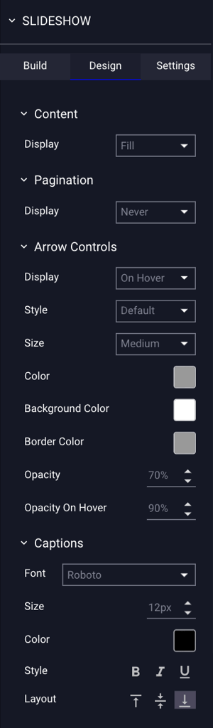
The Slideshow component Design configuration options are explained below:
| Content | |
| Display | By default, images will Fit within the component area, but you can also choose to have them "Fill" the area instead. |
| Pagination | |
| Display | By default, pagination is disabled. Optionally, you may choose Always, or On Hover. Additional menu options are available if pagination is enabled. |
| Format | If pagination is selected, choose from dotted pagination, or thumbnails*. |
| Placement | Placement of the pagination - Top or Bottom. |
| Size | Size of the pagination - Small, medium or large. |
| Container Color | The color of the pagination container. |
| Opacity | The opacity of the pagination container. |
| Dot Color | If "Dots" are selected for the Pagination, you can choose the color of the dots. |
| Active Thumbnail | If "Thumbs" are selected for the Pagination, you can choose the color of the Active Thumbnail. |
| Arrow Control Color | If "Thumbs" are selected for the Pagination, you can choose the color of the pagination arrows. |
| Arrow Controls | |
| Display | By default, arrows will display on hover. You may also choose Always to display the arrows at all times, or Never to hide the arrows. |
| Style |
By default, arrows will be placed on the left and right side of the slideshow, and will display our Default arrows. There are four styles of arrows to choose from:
|
| Size | The size of the arrows: small, medium, or large. |
| Color |
The color of the arrows. * Note - Only the "Default" style of arrows allows you to choose a border and background color. |
| Opacity | The opacity of the arrows. |
| Captions | |
| Font | Captions (if enabled on the slide) will be displayed in the selected font. |
| Size | Font size measured in Pixels. |
| Color | Font Color. |
| Style | Optional styling for captions, including Bold, Italicize and Underline. |
| Layout | Positioning of the captions, including bottom, top, and middle. |
When thumbnail is selected as a pagination option, within the build section of the menu, a thumbnail editor will be visible. Click Edit to modify the thumbnail.
How to Modify the Transition Settings of the Slideshow
The Slideshow component transition settings are explained below:
- Click the Settings tab at the top of the Slideshow properties menu:

The Slideshow component Settings configuration options are explained below:
| Slides | |
| Per Display | By default, the number of assets to display in the slideshow is set to 1. You can modify this setting to display additional assets at the same time. |
| Per Display Spacing | Spacing between slides, measured in pixels. |
| Per Transition | By default, the number of assets to transition when utilizing the manual navigation arrows, or automatic transition is set to 1. You can modify this setting to transition additional assets at the same time. |
| Transitions | |
| Transitions | By default, transitions between slides is set to Automatic. If the transition setting is set to Manual, the user must utilize the navigation arrows to transition between slides. |
| Pause on Hover | When selected, transitions will pause if the user hovers over the slideshow with the cursor. |
| Duration | The time between transitions, measured in seconds. |
| Effect |
The transition effect:
|
| Speed | The transition speed, measured in seconds. |
| Loop | By default, the slide transitions will loop indefinitely, unchecking this option will pause the transitions once reaching the last slide. |
| Randomize Slides | Randomize the order to the slides. |