Sticky Sidebar
Maximize viewability with our Sticky Sidebar, which slides into view on the left or right side of the users screen and will follow the user as they scroll.
Resources:
Explore our Ad Gallery for examples of this format
In this article, you will learn:
How to Build a Sticky Sidebar Unit
How to Configure the Sticky Sidebar Unit Properties
How to Build a Sticky Sidebar Unit
Below you will find a step-by-step process to build a Sticky Sidebar unit.
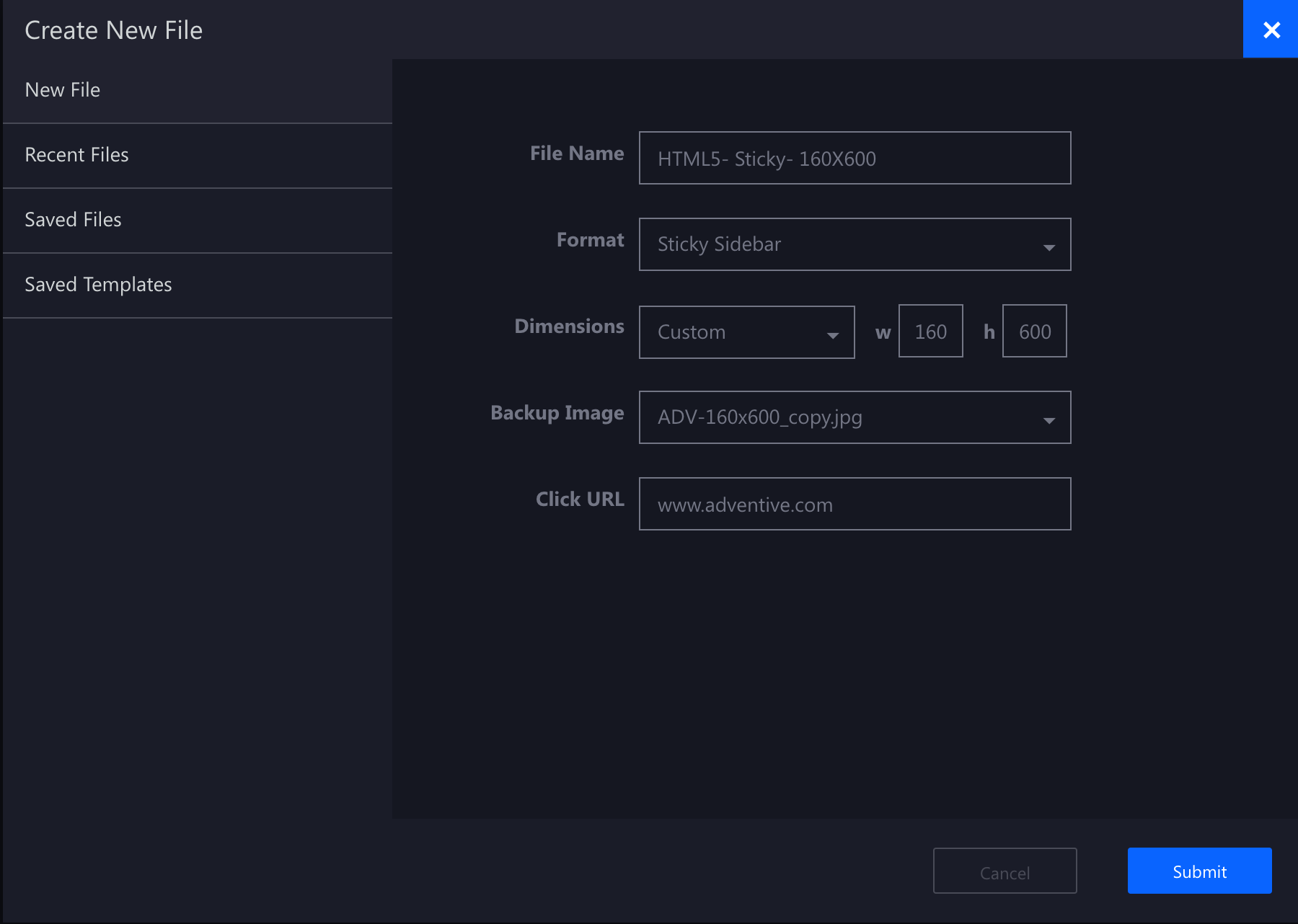
- Provide a unique Name for the unit, and select Sticky Sidebar from the Format dropdown
- Define your initial ad dimensions (or select one of Adventive's pre-populated options)
- Backup Image (Optional) and Click URL (Optional) may be left blank at this time, click Submit

Configuring the canvas
The builder will now load the main Sticky Sidebar canvas based on the dimensions inputted in step #2. You may now place your ad content which will be displayed in a fixed position either at the left or right of the page depending on the settings configured in the next section.

The Sticky Sidebar format supports multi-screens for additional interactivity or expansion. Learn how to add additional screens in this article and how to control navigation between screens in this article.
How to Configure the Sticky Sidebar Unit Properties
The Sticky Sidebar properties configuration options are explained below:
| Position | The position of the ad unit relative to the users screen. The options include: Top Left, Top Right, Bottom Left, and Bottom Right (default). |
| Padding |
If a "Top" position is selected, the "Top Padding" option will display. If a "Bottom" position is selected, the "Bottom Padding" setting will display. Padding allows you to add additional space above or below the unit to fine tune positioning onsite. For example: Top Padding may be added to accommodate the height of a site's navigation menu, to ensure the unit loads below the menu. |
| Reveal speed |
The speed (in seconds) in which it takes for the ad to come into view |
| Top bar color | Click to change the color of the top bar |
| Hide close button | If selected, the default "X" close button will not appear |
| Close button icon | Click the input box to upload a custom close button icon |
| Lock to bottom | When selected, the ad will not follow the viewer's page scrolling, instead, the ad will remain locked to the bottom corner of the page |
| Close on timer | When selected, the ad will close based on the following secondary settings: Time Color - Change the color of the timer Seconds - The number of seconds before auto-closing the unit Show Timer - Display the timer in the top bar area of the ad unit Cancel on Engagement - If the viewer interacts with the ad, the timer will terminate and the unit will remain open. |