Adhesion
Highly visible, responsive ads anchored to the top or bottom edge of the device.
Resources:
Explore our Ad Gallery for examples of this format
In this article, you will learn:
How to Configure the Adhesion Unit Properties
How to Build an Adhesion Unit
Below you will find a step-by-step process to build an Adhesion unit.
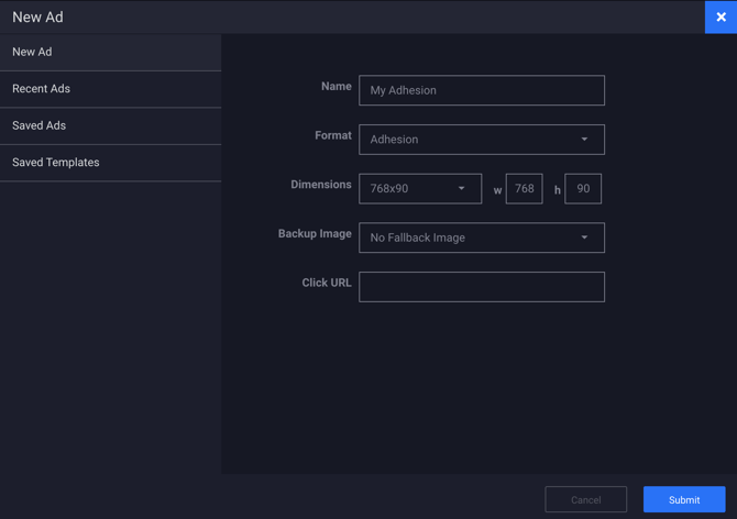
- Provide a unique Name for the unit, and select Adhesion from the Format dropdown.
- Define your initial ad dimensions (or select one of Adventive's pre-populated options).
- Backup Image (Optional) and Click URL (Optional) may be left blank at this time, click Submit.

Configuring the canvas
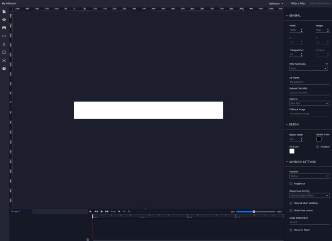
The builder will now load the main Adhesion canvas based on the dimensions inputted in step #2. You may now place your ad content which will be displayed in a fixed position either at the top or bottom of the page depending on the Adhesion Settings configured in the next section.
The Adhesion format supports multi-screens for additional interactivity or expansion. Learn how to add additional screens in this article and how to control navigation between screens in this article.

Configuring the General Ad Properties
Modifications can easily be made to the general ad configuration using the General Ad Properties panel on the right-hand side of the builder window. See this article for instructions on configuring the General Ad Properties.
How to Configure the Adhesion Unit Properties
The Adhesion properties configuration options are explained below:
| Position | The position of the ad unit relative to the users screen. The options include: Top, or Bottom. |
| Roadblock |
The roadblock option prevents the user for navigating away from the unit by hiding the close button for a defined number of seconds. |
| Seconds | If the roadblock option is enabled, this setting controls the number of seconds the close button is hidden before being revealed. |
| Responsive Setting | Maintain Aspect Ratio - if selected, will maintain aspect ratio of imagery. Maintain Height - if selected, will keep a constant adhesion ad height and will truncate the width of the ad when responsive. |
| Hide ad when scrolling | When selected, the ad will be hidden when the viewer scrolls the page, but reappears when scrolling stops. |
| Disable close button | When selected, the default "X" close button will not appear and the ad will always display. |
| Close button icon | To upload a custom close button icon image, click the input box, upload the icon, or select from the asset manager. |
| Close on Timer | When selected, the ad unit will automatically close after a defined set of seconds. |
| Timer Color | The color of the timer, if set to display. |
| Seconds | The number of seconds before the ad unit will automatically close. |
| Show Timer | When selected the timer will be displayed. |
| Cancel on engagement | When selected, the timer will be disabled and the ad unit will not automatically close if the viewer interacts with the ad unit. |