.svg)
Resources:
Explore our Ad Gallery for examples of this component
In this article, you will learn:
How to Add the Forms Component
How to Modify the Build of the Form
How to Resize and Rearrange the Order of the Form Fields
How to Edit Label Naming Conventions of the Form
How to Modify the Design of the Form
How to Configure the Form Settings
How to to Add the Forms Component
Below you will find a step-by-step process to configure the Forms component.
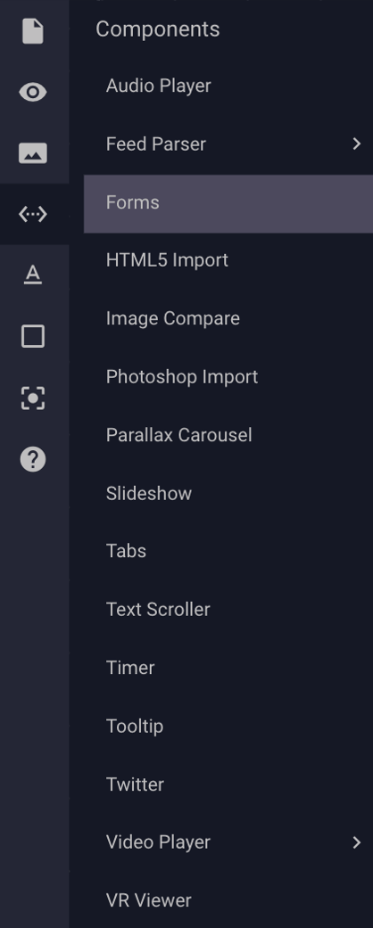
- Once you’ve created your ad, select Forms from the Components dropdown menu.
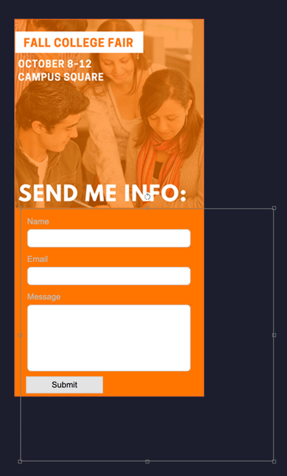
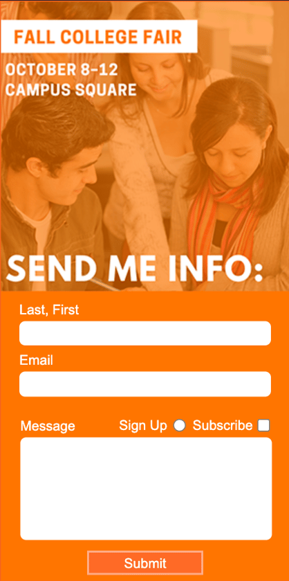
- You’ll now see a form placeholder on your ad canvas. Click the form to select it. By default, your form will have 3 fields – Name, Email and Message, as well as a Submit button.
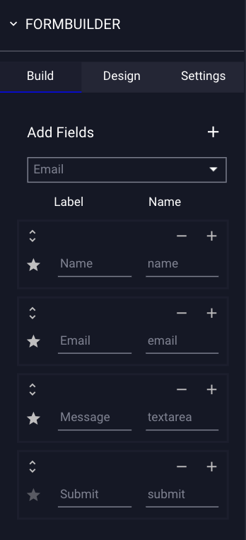
- Once your form is selected on your canvas, the Form Builder properties will display in the Properties Panel on the righthand side of the builder:
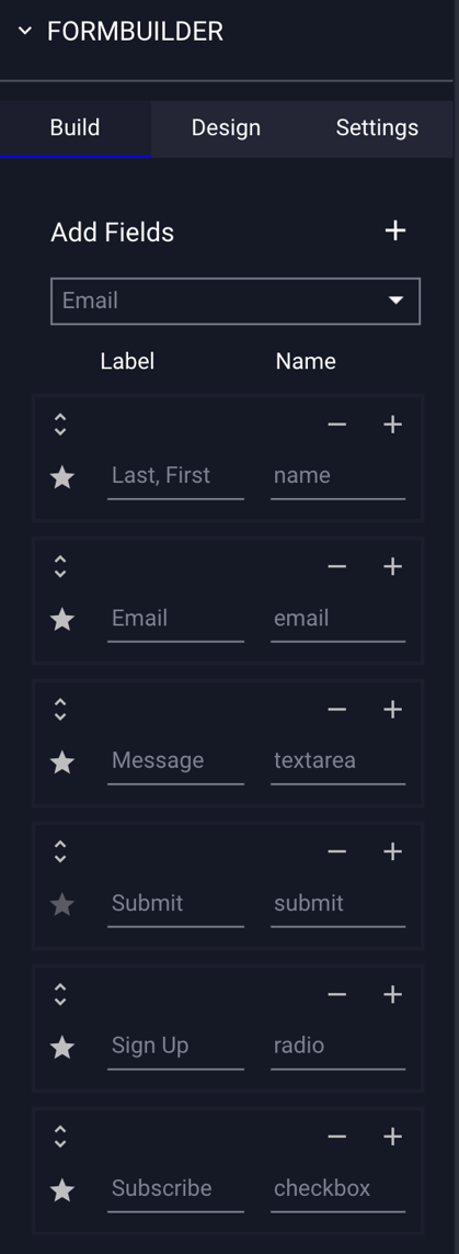
How to Modify the Build of the Form
Build refers to the fields in the form. You can add fields, radio buttons, check boxes, rearrange the order, and delete fields.
* Note - By default, the form will include Name, Email, and Message fields, and a Submit button.
- To change Build settings, select the form and the form builder properties will display in the Properties panel to the right. Click on the "Build" tab.
The Build options are explained below:
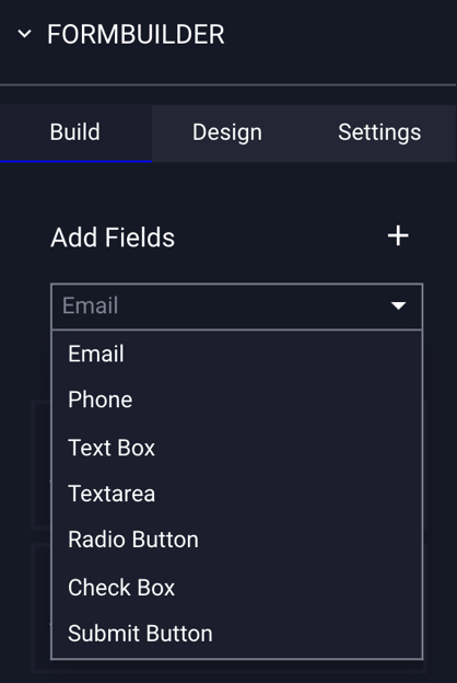
| Add Fields | Make a selection to add a field, then click the plus sign button (+) located at the top of the menu. The new field will be added to the bottom of the list of fields within the Forms Properties Panel. |
| Label | The label of the field that will appear on your form. Click into the Label field to edit the name of your label. |
| Name | The name of the function of the field. Click into the Name field to edit the name of the field function. |
| - | Click the - next to a field to remove it. |
| + | Click the + next to a field to add a new field immediately after it. |
|
|
Click and drag the double arrow icon next to any field to rearrange it within the Form Properties Panel. * Note - This will not rearrange the fields on the canvas. This will rearrange the tabbing function for all fields on live preview. See below notes for how to rearrange forms on the canvas. |
| ☆ |
Next to each label in the form builder is a star icon. If selected, the star will change to red, indicating that field is required, and will place an asterisk next to it on live preview. |
| Adds an email field to the form, in which users can input their email address. | |
| Phone | Adds a phone field to the form, in which users can input their phone number. |
|
Text Box |
Adds a custom text box field to the form, in which you can choose a custom field to input information into. |
| Textarea | Adds a "message" text area field to the form, in which users can submit a message. |
| Radio Button |
Adds a Radio Button to the form. * Note - You can add a predefined set of mutually exclusive Radio Buttons by ensuring that the "Name" field for each radio button is the same. This will allow users make a selection between a set of options, where only one of which can be selected at any time. |
| Check Box | Adds a checkbox to the form. |
| Submit Button | Adds a submit button to the form. |
- To add a new field, ensure that the form is selected on your canvas and navigate to the Form Properties Panel on the right side of the builder.
- Click on the dropdown menu underneath "Add Fields", make a selection, and then click the + button:
- Your new field will appear at the bottom of your list of fields. In the below example, we've added a "Radio Button" and "Checkbox":
- Same example on canvas, with an added Radio button and Checkbox:
How to Resize and Rearrange the Order of the Form Fields
- To resize any field in your form, click on the form on your ad canvas and select the field you would like to resize. Resize the field by dragging the resize handles on the edges of the field. (i.e. see "Name" field example below):
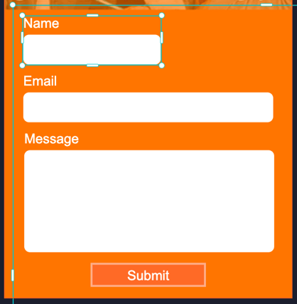
- To rearrange the order of the fields within your form, click on the form on your ad canvas and select the field you would like to move. With it selected, drag it to the area for placement. All fields in the form can be selected and moved.
- In the below example, we will move the "Name" field below the "Email" field.
Before:
After: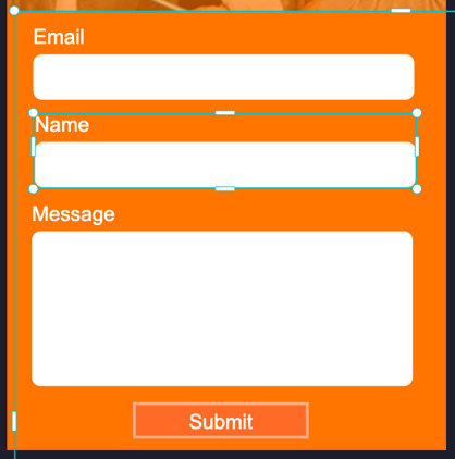
How to Edit Label Naming Conventions of the Form
- Click into the Label field to edit the name of your label.
Example, click into the “Name” field: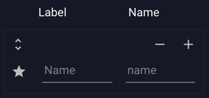
Rename it to “Last, First”: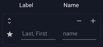
- This is how it will now appear in your Form:

- Example with Radio buttons and Checkbox naming changed by clicking into Label field and editing:

How to Modify the Design of the Form
Design refers to overall look and style of the form. You can change the font, font style, size, color, and Label Placement of the Form Labels. You can also change the style of the field Inputs and buttons/checkboxes.
- To change Design of the form, select the form and the form builder properties will display in the Properties panel to the right. Click on the "Design" tab.
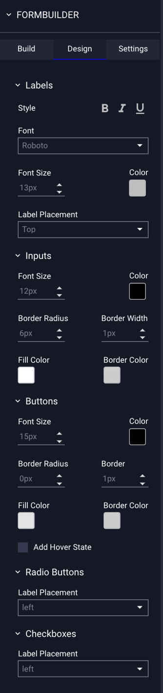
The Design options are explained below:
| Labels | Styling options for the form field labels. |
| Style | The style of your field labels - Bold, Italics, and Underline. |
| Font | The font selection for field labels. |
| Font Size | Font size of field labels. |
| Color | Click to open the color picker and select a color for field labels. |
| Label Placement | Refers to the location of the different labels for each text field within the forms component - Choose Left, Inside Prompt, or Top. |
| Inputs | Refers to the various style options for the boxes/fields within the forms component. |
| Font Size |
Choose the size of the font for each form field input. |
| Color |
Click to open the color picker and select a color for the field input text. |
| Border Radius |
The radius of input boxes. The higher the radius, the more rounded the box corners are. * i.e. - 0 radius = square corners |
| Border Width | The border size of input boxes in pixels. |
| Fill Color | Click to open the color picker and select a fill color for input boxes. |
| Border Color | Click to open the color picker and select a border color for input boxes. |
| Buttons | Refers to the various style options for the submit button. |
| Font Size |
Choose the size of the font for the button. |
| Color |
Click to open the color picker and select a color for the submit button text. |
| Border Radius |
The radius of the submit button. The higher the radius the more rounded the button corners are. * i.e. - 0 radius = square corners. |
| Border | Border size of the submit button in pixels. |
| Fill Color | Click to open the color picker and select a fill color for the submit button. |
| Border Color | Click to open the color picker and select a border color for the submit button. |
| Add Hover State | Optional setting to change the hover state color of the button. If selected, you can choose a new fill color, border color, and text color for the button, to be displayed when users hover over it. |
| Radio Buttons | Refers to the location of the different labels for each Radio Button within the forms component. |
| Label Placement | Choose Left, Right, Top, or Bottom for the Radio Button Label Placement. |
| Checkboxes | Refers to the location of the different labels for each Checkbox within the forms component. |
| Label Placement | Choose Left, Right, Top, or Bottom for the Checkbox Label Placement. |
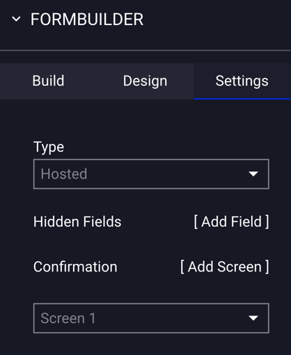
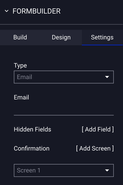
How to Configure the Form Settings
Within the Settings tab, you can select options for form submissions and data collection.
- To change Settings, select the form and the form builder properties will display in the Properties panel to the right. Click on the "Settings" tab.
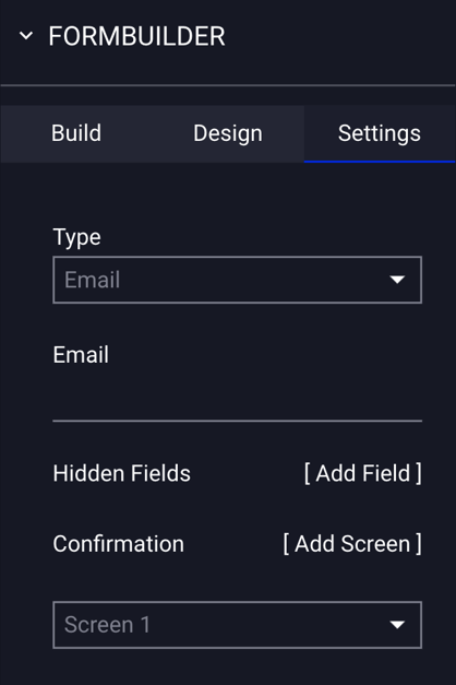
- Select the method for data collection from the Type dropdown menu - Email, Post HTTP, Get HTTP or Hosted.
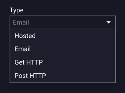
| Type | The method to receive form submission data. |
| Hosted |
Adventive will collect and host form submission data. See example below. |
|
Receive form submission data by email as they are submitted – one email per submission. See example below. |
|
| Email Field | If email is selected from the "Type" dropdown, input the email address of the recipient who will be receiving the form submission data. |
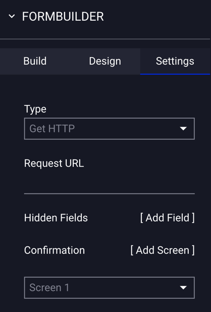
| Get HTTP |
Submits for data directly to an external resource. This method allows you to integrate with third-party vendors like MailChimp or Constant Contact, or send data to an online database. * Select this if the server accepting the form submission is expecting all of the data to be passed as parameters in the URL. See example below. |
| Request URL |
If Get HTTP is selected from the "Type" dropdown, click in the input box and type in the URL for the web server that will accept the form submissions. * i.e. - http://form.com/process/ |
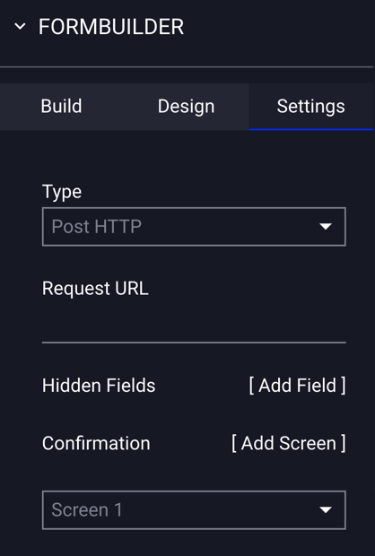
| Post HTTP |
Submits for data directly to an external resource. This method allows you to integrate with third-party vendors like MailChimp or Constant Contact, or send data to an online database. * Select this if the server accepting the form submission is expecting all of the form data to be in the body of the request. See example below. |
| Request URL |
If Post HTTP is selected from the "Type" dropdown, click in the input box and type in the URL for the web server that will accept the form submissions. * i.e. - http://form.com/process/ |
| Hidden Fields [Add Field] | Hidden fields are similar to text fields, but are not displayed to the user. Hidden fields are used to submit information that is not entered by the visitor. A hidden field might be used to identify the form source or the ad or campaign name. |
| Name | If a Hidden Field is added, input the name of the label for the hidden field here. |
| Value | If a Hidden Field is added, input the text identifier for the hidden field here. |
| Confirmation [Add Screen] | From the dropdown, select the screen of the ad to display after the user has submitted the form. If you only have 1 screen you can click [Add Screen] here to quickly add another. The screen with then be added to the Screens & Layers panel. |
Hosted
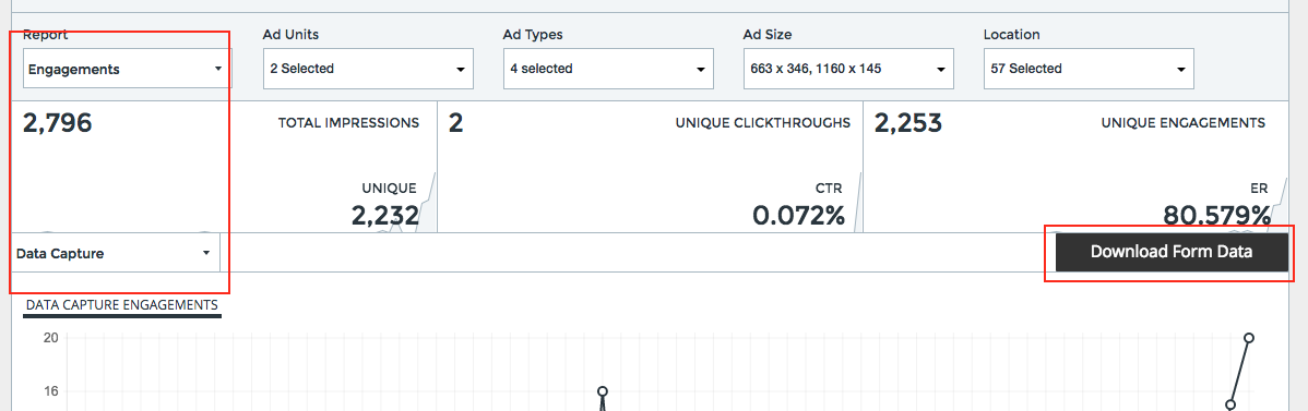
- Adventive will collect and host form submission data if you select "Hosted" as your configuration type.
- To download a CSV file containing all data captured from the form component, navigate to Analytics at the top of the dashboard, then select the campaign containing your ad with the form.
- Open the Engagements report and select Data Capture from the dropdown menu - you will see a "Download Form Data" button to the far right - click on this to download (screenshot below):
- Receive form submission data by email as they are submitted – one email per submission.
Example of form submission email received: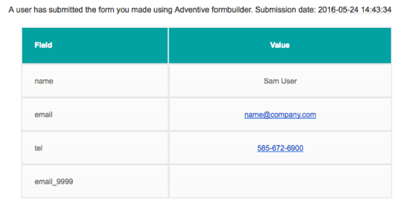
Post and Get HTTP
- GET and POST HTTP are two different types of HTTP requests. The servers that are accepting the form submission information are typically expecting one of these methods and all other methods will be ignored. Users should consult with their technical teams to determine which method is appropriate.
Get HTTP
- Get HTTP submits form data directly to an external resource. This method allows you to integrate with third-party vendors like MailChimp or Constant Contact, or send data to an online database.
- If the server accepting the form submission is expecting all of the data to be passed as parameters in the URL, then GET HTTP should be selected.
BELOW IS AN EXAMPLE (urls/fields/request will differ):
In the builder:
- Select Get HTTP
- Request URL = http://form.com/process/
- Add a form field named first_name
- Add a form field named last_name
When the form is submitted, the a GET request will be made to:
http://form.com/process/?first_name=Bob&last_name=Smith
Post HTTP
- Post HTTP submits form data directly to an external resource. This method allows you to integrate with third-party vendors like MailChimp or Constant Contact, or send data to an online database.
- If the server accepting the form submission is expecting all of the form data to be in the body of the request, then POST HTTP should be selected.
BELOW IS AN EXAMPLE (urls/fields/request will differ):
In the builder:
- Select Post HTTP
- Request URL = http://form.com/process/
- Add a form field named first_name
- Add a form field named last_name
When the form is submitted, the a POST request will be sent to:
the following data will be sent in the body of the request:
first_name=Bob&last_name=Smith
- Post URL: click in the input box and type in the url for the web server that will accept the form submissions
Hidden Fields [Add Field]
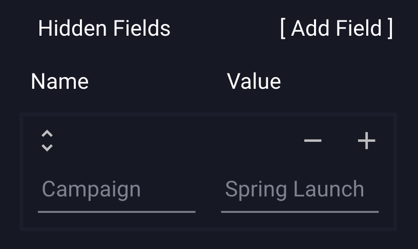
- Hidden fields are similar to text fields, but are not displayed to the user. Hidden fields are used to submit information that is not entered by the visitor. A hidden field might be used to identify the form source or the ad/campaign name.
- For example, if you wanted to add the name of the campaign that the ad with the form was from, you’d click [Add Field] to add a hidden field and enter the campaign name (i.e. - "Spring Launch", for example).
- Hidden Fields [Add Field]: Adds a new hidden field
- Name: The name of label for the hidden field.
- Value: The text identifier for the hidden field.
- So for the campaign name example, you’d enter "Campaign" as the Name, and "Spring Launch" as the value:
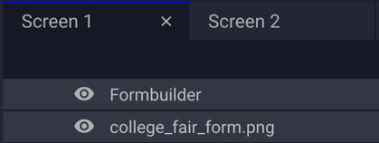
Confirmation [Add Screen]
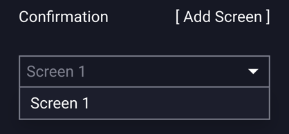
- From the dropdown menu, select the screen of the ad that will display after the user has submitted the form.
- If you only have 1 screen, you can click [Add Screen] to quickly add another.
- The new screen with then be added to the Screens & Layers panel:
Save the ad.
Go to the Preview icon  to view the ad.