.svg)
Resources:
Explore our Ad Gallery for examples of this format
In this article, you will learn:
How to Configure the Expand and Collapse Functionality
How to Build a Pushdown Unit
Below you will find a step-by-step process to build a Pushdown unit.
- Provide a unique Name for the unit, and select Pushdown from the Format dropdown
- Define your initial ad dimensions (or select one of Adventive's pre-populated options)
- Define your expanded state ad dimensions (or select one of Adventive's pre-populated options)
- Backup Image (Optional) and Click URL (Optional) may be left blank at this time, click Submit

Configuring the canvas
The builder will now load the main Pushdown canvas based on the dimensions inputted in step #2 (referred to as Screen 1), while the expanded state screen based on the dimensions inputted in step #3 (referred to as Screen 2).
By default, Adventive will insert a "Expand Ad" and "Collapse" ad placeholder on their respective screens. These can be deleted if you plan to supply your own, or if you plan to apply auto expand and collapse functionality.
See this article for information on expansion and collapse actions.
Screen 1: Collapsed State

Screen 2: Expanded State

Configuring the General Ad Properties
Modifications can easily be made to the general ad configuration using the General Ad Properties panel on the right-hand side of the builder window. See this article for instructions on configuring the General Ad Properties.
How to Configure the Expand and Collapse Functionality
Pushdown ad units (or any multiscreen) ad units require either actionable buttons to navigate between screens, or automated timers to navigate between screens.
In the below example, we will use the default "Expand Ad" and "Collapse Ad" buttons to demonstrate how this functionality works, and how it can be applied to virtually any asset on the canvas.
Configuring an Expand Action
Click on the Expand Ad layer on Screen 1.
- The properties panel to the right-hand side of the builder will show the "Action" menu as seen below. This action has been predefined by the format you've selected, however, you can add a action with similar functionality to any asset by clicking the "Add Action" button when the object you would like to program has been selected:
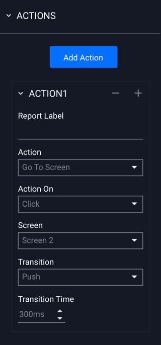
The Action properties configuration options are explained below:
For a detailed guide and explanation of all actions and their associated settings, take a look at this article
| Report Label | (Optional) The label used to identify any action that occurs on this particular object in the analytics reports. |
| Action | The action that occurs when the user performs the defined action specified in the Action on dropdown. |
| Action On | The action required of the user for the action event to fire. |
| Screen | The screen in which the action will be navigating to. |
| Transition |
The type of transition - Slide, Fade, or Push.
|
| Transition Time | The amount of time for the transition to occur, expressed in milliseconds. |
| Direction | If "Slide" or Fade" is selected for the Transition, you can choose the direction of the transition (which way will the ad expand). |
* Note - You can change the transition types for the buttons within the ad, however this will change the inherent "Pushdown" functionality of the ad format as a whole.
For example, the "Slide" transition will mimic the Expandable ad format functionality instead.
Configuring a Collapse Action
Click on the Collapse Ad layer on Screen 2.
- The procedure for configuring the collapse action is nearly identical to that of the expand action, however, the screen destination is updated to Screen 1 as seen below:
