.svg)
In this article, you will learn:
Multi-Select, Movable, & Draggable Options
Ad Builder Overview
Designed to mimic popular creative development tools, Adventive's Ad Builder provides an intuitive, powerful interface to quickly design and implement rich media ad units. The following section outlines the main components of the Ad Builder and their purpose.
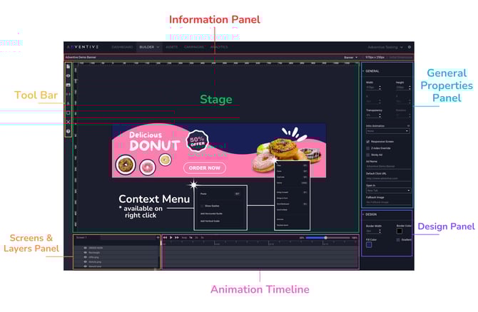
Information Panel
The information panel provides general information about the open ad unit. At a glance, you can see the ad name, the format and initial dimensions. You can also change the selected format by clicking the down arrow to the right of the format name and selecting a new format.
Tool Bar
The tool bar, located to the far left of the screen contains several icons which control various functions of the builder.

Below is an explanation of each of the toolbar controls:
|
|
File Menu Create new or open existing ads or templates, save, undo, redo, import, and export ad units. Also view and adjust builder settings. |
 |
Preview |
 |
Assets |
 |
Components |
 |
AI Tools |
 |
Text Inserts a text object onto the ad stage. |
 |
Shapes Inserts a shape object onto the ad stage. |
 |
Hitbox Inserts a hitbox object onto the ad stage. A Hitbox is a transparent layer that can be added over any element to provide additional click, hover or other events or actions. |
 |
Animate Opens Adventive's animation tools. This option will not be displayed in the toolbar menu unless an object which can be animated is selected on the stage. |
 |
Help Opens Adventive's knowledge base and support chat widget. |
Stage
The stage is the main window area used to visualize the development of the ad unit. The canvas of the ad unit is located in the center of the stage, and Adventive's drag-and-drop builder allows all of the elements on the stage/canvas to be positioned and resized individually. The stage also includes rulers on the top and left sides to ensure proper alignment of objects on your canvas. Clicking on any element on the stage will open properties associated with the selected element within the right side properties panel.
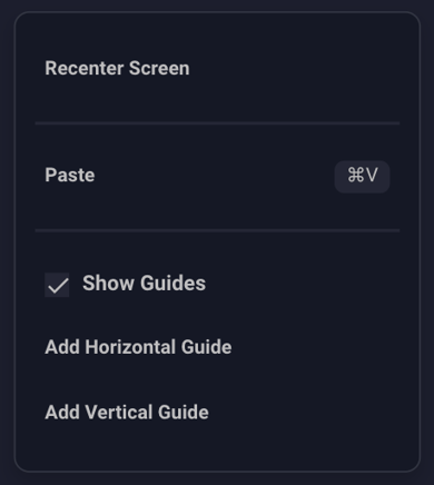
Context Menus
The context menu is available on right click (or control + click) on the canvas, on the surrounding stage, and in the bottom Screens & Layers panel.
- On the surrounding stage (off canvas) you have the option to recenter the screen in the viewable stage area, paste assets, show guides, and add both vertical and horizontal guides:
- On canvas, the context menu contains additional options for the specific asset layer that is right-clicked (or control + clicked):

On-Canvas Context Menu Options
| Center on Stage | Center the selected asset in view on the stage. |
| Copy | Copy the selected asset. |
| Paste | Paste a copied asset. |
| Duplicate | Duplicate a selected asset. |
| Delete | Delete a selected asset. |
| Defaults |
Allows you to Set Text Defaults and Reset Text Defaults:
|
| Order |
Menu allows you to set the order of the asset layer within the Screens & Layers Panel. The following options are available here:
|
| Align to Screen |
Menu allows you to align the selected asset on your screen. The following options are available here:
|
| Move to Screen |
When applicable, allows you to move the selected asset to another existing screen in your ad. |
| Animate | Animate the selected layer (will open the Animations menu). |
| Replace with Asset | Replace an asset with another asset from the asset panel. Layers can also be right clicked and replaced from the Screens & Layers panel. |
| AI Image Editing |
|
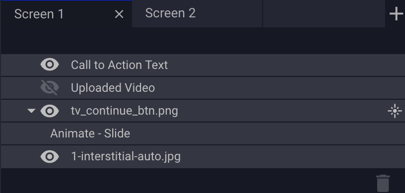
Screens & Layers Panel
Screens & Layers provides a visual representation of the elements on the ad unit and the relative position of each of the layers for each screen contained within the ad unit. Clicking any of the layers will highlight that element on the stage. Clicking any of the Screen tabs will change the builder to that screen.
More information can be found within our Screens & Layers article.
 |
 |
Add a new screen |
|
Layer visible | |
 |
Layer invisible | |
|
Layer contains an animation | |
 |
Delete layer |
Multi-Select, Movable, & Draggable Options
Our builder supports multi-select of image assets, components, shapes and text layers.
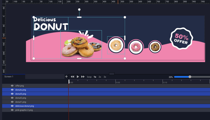
- To individually multi-select objects, click the first layer (either within the canvas/stage area, or within the screens & layers panel), hold the Command (⌘) key, then individually select the additional layers you'd like added to the multi-selection:
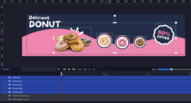
- To select layers sequentially in the layers panel, click the first layer you'd like to select from the list, hold the Shift key, and then click the last image you'd like to select in the list within the screens & layers panel. The sequence of layers will be selected:
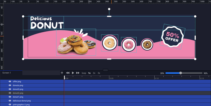
- You can then also deselect individual layers by holding the Command (⌘) key and clicking the layer you'd like to deselect. That individual layer will then be deselected:
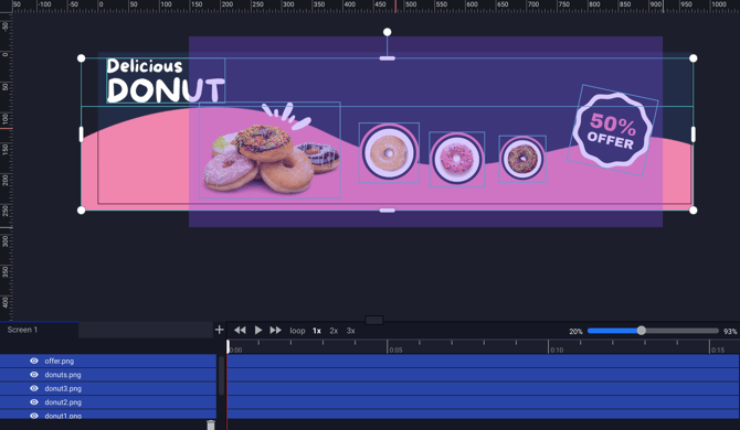
- To select a group of images on the canvas/stage, simply click and drag over the the layer's you'd like to select. The cursor will create a transparent rectangle shape, which, when dragged over multiple layers, will select the layers as a group:
- Multi-selection of objects also allows you to scale, resize, and move multiple objects on your stage collectively:
General Properties Panel
The property panel is a context-aware set of controls, that will automatically update with the properties that can be manipulated give the selected element or component.
- Clicking off of any element, or outside of the canvas area onto the stage will reveal the General Ad Properties:

- More information can be found within our Configuring Ad Properties article.
- Selecting an asset, object, or component will display the size, coordinates, and other configuration options for that specific selection. For example, below we have selected an individual image asset:
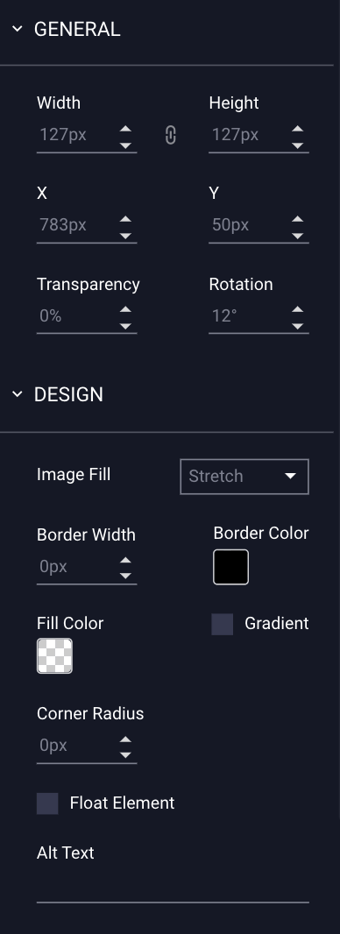
- More information can be found within our article: How to Configure the Design Settings for Image Assets.
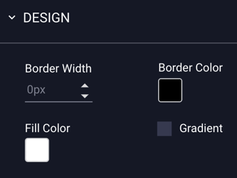
Design Panel
By default, all ad units are created with a white background and no border. Many of these options will apply to selected images, objects, and components on the stage, however, if no object is selected, or the user clicks outside of ad the unit on the stage area, the panel will display the "Design" settings of the ad unit as a whole. More information on this can be found within our Configuring Ad Properties article.
Animation Timeline
The animation timeline provides a visual representation of any animation that may be applied to an element on the stage.
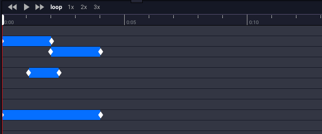
More information on adding Animations can be found within our Animations article.