.svg)
Resources:
Explore our Ad Gallery for examples of this feature
Adventive Sticky Video Example
In this article, you will learn:
How to Create a Sticky Video Unit
How to Set Up the Sticky Video Canvas
How to Configure the Uploaded Video Component Build Options
How to Configure the Uploaded Video Component Settings
How to Configure the Sticky Video Options
How to Create a Sticky Video Unit
- When a user scrolls past a video ad made sticky, and the unit moves out of the viewable area of the screen, the video automatically pops out and anchors to a specified location on screen.
- The video will load in-article initially, and once the in-feed video has been scrolled past, the video pop up in the lower right hand corner of the screen by default. The positioning can be adjusted.
- Also see articles on Video and Video Asset Optimization
Below you will find a step-by-step process to create a Sticky Video ad unit.
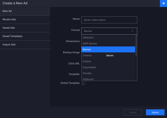
- Choose the ad format and dimensions of the ad unit you wish to add the Video component to. For guidance on building specific formats, check out this article.
- In this example, we will select the Banner format from the dropdown menu:
- Select the ad dimensions or click custom to enter your own. In this example, we've made the ad canvas 855 x 481px:
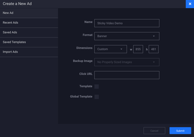
- Click Submit.
How to Set Up the Sticky Video Canvas
- A blank canvas will load onto the screen. This is where you'll place your ad content and Video.

- Configure the general properties of the unit within the Properties Panel, located on the righthand side of the builder.
* More information on configuring the general properties of the ad unit can be found within our article Configuring Ad Properties.
- For this example, our entire ad unit canvas will be a Video.
- Add a Video to the canvas either by clicking the Image Asset icon
 or by selecting tor the Component icon
  and choosing Uploaded Video from the list of sources:
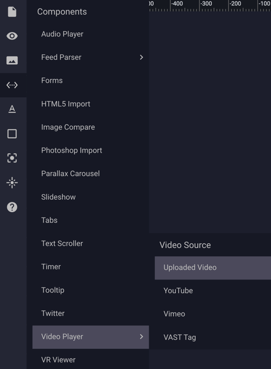
- Once the Uploaded Video Component has been selected, the Video placeholder will appear on the canvas:

- Select the video on your canvas and resize as needed by clicking and dragging the resize handles on the component, or by entering in the desired size within the General Properties Panel in the upper righthand side of the builder.
- In the below example, we have resized the video component to the exact size of the ad unit dimensions (855 x 481px).
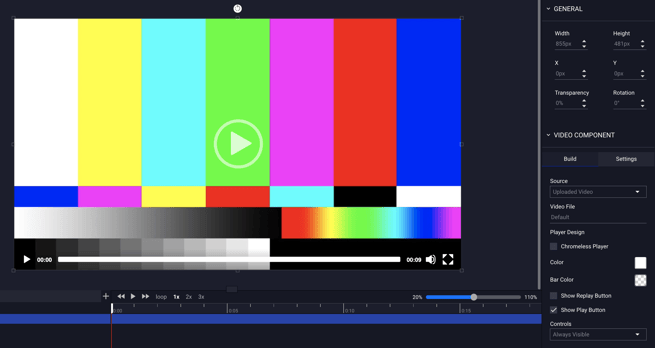
- With the Video selected, you will see the Video Component settings appear to the right of the Builder under the General Properties.
How to Configure the Uploaded Video Component Build Options (Build Tab)
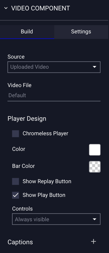
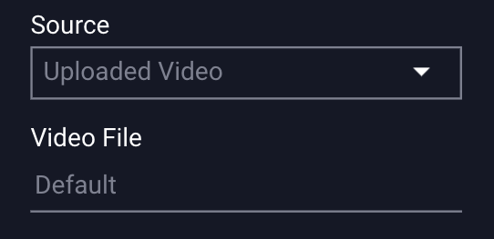
- Source: Uploaded Video - Select your video by clicking the input box marked “Default” under Video File.
- The Asset Manager will open, and only video files will be displayed. If you need to upload a video, click the "Upload" icon at the bottom left of the window, and click "Insert" in the bottom right of the window once your video file is selected:

* Upload an .mp4, .mov, .ogg, .flv, .avi, .ogv, and .webm file and Adventive will encode, host and stream your video in a fully customizable HTML5 player.
- Once you have selected your video, the file will appear in the Video File field within the Video properties panel:
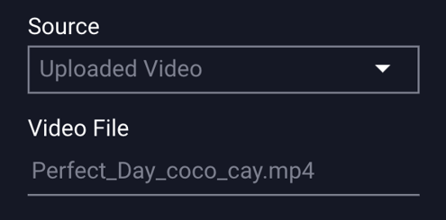
The Uploaded Video component "Build" options are explained below:
| Player Design | |
| Chromeless Player |
A player that has no control bar with options for muting, play/pause, and full screen controls only. * More information on this can be found below this table. |
| Color | Clicking into the box allows for selection of the player icon's color. |
| Bar Color | Clicking into the box allows for selection of the player bar's color. |
| Controls | |
| Always Visible | If selected, the controls will show for the entire video duration. |
| Show on Hover | Controls will show when the user hovers over the video. |
| Show Replay Button | Displays replay button in center of the video when complete and if clicked, will then replay the video with the current audio setting. |
| Show Play Button | If selected, a play button will appear in the center of the video. |
| Preview Image |
Displays a selected preview image before the video plays. |
| End Frame Image |
Displays a selected end frame image after the video completes. |
| Captions |
Click the plus (+) sign to add captions to your Uploaded Video. We support SRT and VTT files. If added, the video player will display a closed caption icon. |
| Display |
Choose when the captions will be displayed:
|
| Default Language |
If "Always" is selected for the above Display option, you will have the option to choose the default language that displays automatically when the video plays. You will have the option to select a specific language, or select "Auto", which will auto-detect the language in the users browser. |
| Language |
Prompt for language selection. Use this to label each file with the specific language. |
| Label |
The label for the language. |
 In preview on hover over, the icon will display the different available languages.
* Note - If Chromeless Player is selected: “Enable Muting Controls” will be selected by default, as sound needs to be user-initiated. Major browsers such as Chrome, Safari, Edge and others have implemented changes that will have an impact on video units which attempt to play with sound automatically, or attempt to play sound when 'hovered over.' Any videos which are detected to automatically play sound, or have a sound on hover option, will be immediately stopped by the browser.
* More information on configuring the Video Build options can be found within our knowledge base article Video.
How to Configure the Uploaded Video Component Settings (Settings Tab)
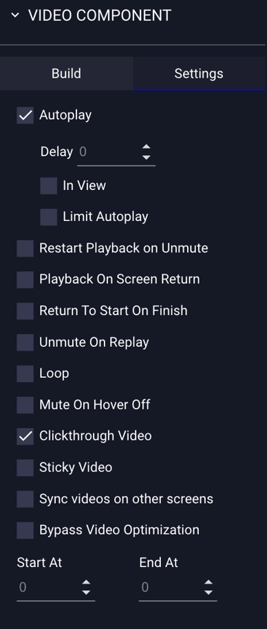
The Uploaded Video component "Settings" options are explained below:
| Autoplay |
Plays the video automatically on load. * Includes autoplay for mobile if selected. Initialization of sound by the user is required - enable the mute button control (see above). |
| Delay | Set a delay in seconds if you don't prefer the Autoplay to trigger immediately. |
| In View | Triggers autoplay when the video enters the viewable area (vs. on page load). The video will play when it comes into view, and will stop when exiting view. Videos, which return to the viewable area, will automatically resume. |
| Limit Autoplay |
Allows the video to autoplay for a specific amount of time before a message pops up saying "click to continue playing". If selected, by default, this is set to 15 seconds. * More information on this can be found below. |
| Restart Playback On Unmute | Video will restart automatically when the unmute button is clicked. |
| Playback On Screen Return |
If the viewer leaves the screen with the video playing and navigates to another screen within the ad unit, the video will automatically stop and resume or restart playback when the user returns. * More information on this can be found below. |
| Return To Start On Finish | Displays first frame or selected preview image after video completes. |
| Unmute On Replay | Custom video will play with sound on user initiated replay. |
| Loop |
Automatically restarts video when complete. If set to 0 (default) it will loop indefinitely. Otherwise, you can select a specific number of times to loop the video when initial playback is complete. |
| Mute On Hover Off | Video sound will be muted when the viewer hovers off. |
| Clickthrough Video | This is selected by default. Allows user to click through to a URL by clicking. |
| Sticky Video |
When a user scrolls past a video ad made sticky, and the unit moves out of the viewable area of the screen, and the video automatically pops out and anchors to a specified location on screen. It can be anchored to the top left, top right, bottom left, or bottom right of the screen. * More information on this can be found below. |
| Sync Videos On Other Screens | This feature allows you to synchronize video playback across multiple screens within the same creative. |
| Bypass Video Optimization |
When this is selected, a message will pop up on screen which asks you to confirm that you have already taken the necessary steps to optimize your video for web prior to uploading, and would not like the video to be automatically optimized by Adventive. |
| Start At |
The time, in seconds, you want to set the video to begin playing. |
| End At |
The time, in seconds, that the video should stop playing. |
* More information on configuring the Video Settings can be found within our knowledge base article Video.
How to Configure the Sticky Video Options
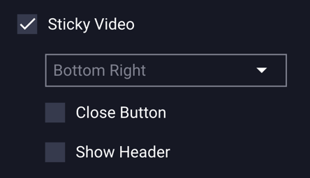
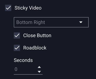
- Make your video setting selections and be sure to select “Sticky Video” under the Settings tab:
- Choose the placement of Sticky Video from the dropdown menu:
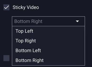
- Choose from Top Left, Top Right, Bottom Left, or Bottom Right positioning.
* Note - The video will load between articles initially, and once the user scrolls past the in-feed video, and you'll see the video pop up in the selected location. We've chosen Bottom Right for this example: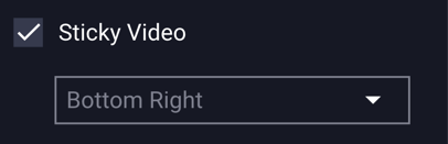
- Close Button – if selected, a default “x” close button will appear so the viewer can close out of the sticky video:
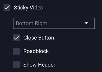
- Roadblock – if selected, this hides the close button for a set number of seconds - click into the "Seconds" field to enter how many seconds before the "X" close button should appear:
- Show Header - if selected, text will display at the top of the Sticky Video unit. By default, the text "ADVERTISEMENT" will display in white, on a black background, but this can be adjusted.
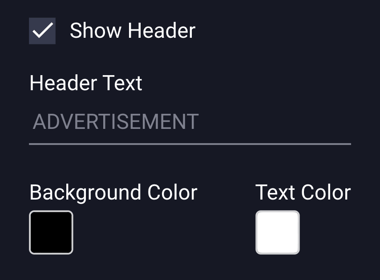
Header Text - click in the Header Text field to change the default “ADVERTISEMENT” text and type in new text for your Header area.
Header Background Color – click in the box to change the header background color.
Header Font Color – click in the box to change the header font color. - Add any other Assets or other elements to your canvas.
- Save the ad.
- Go to the Preview icon
 to view the ad.